Browse categories
Explore
Fiverr Pro
English
$
USD

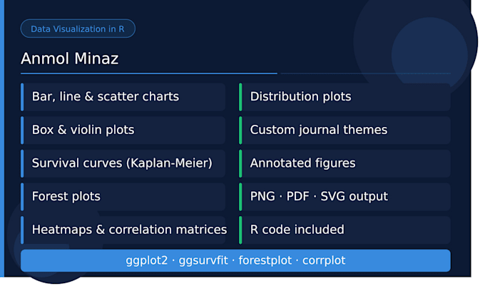
Raw numbers don't tell a story - visuals do. Whether you need clean charts for a publication, compelling figures for a thesis, or visuals for a report, I can turn your data into clear, professional graphics using R.
I am an epidemiologist with an MPH in Epidemiology from Emory University and 3+ years of experience producing publication-ready visualizations for academic research, WHO-commissioned projects, and peer-reviewed publications.
What's included:
Tools: R (ggplot2, ggsurvfit, forestplot, corrplot)
What you'll receive: high-resolution figures (PNG/PDF/SVG), the R code used to generate them, and any formatting adjustments needed for your target journal or report style.
Not sure what kind of visual fits your data? Message me first - I'm happy to advise.
Research analyst and project coordinator
Languages
What file formats will I receive for the visualizations?
You'll receive high-resolution figures in your preferred format - PNG, PDF, or SVG - along with the R code used to generate them so you can make future edits.
What do I need to provide to get started?
Please share your dataset and let me know what you'd like to visualize. If you have a specific chart type, color scheme, or journal style guide in mind, include that too.
Can you match the style of a specific journal or template?
Yes. If you provide the journal's figure guidelines or a style reference, I'll format the visuals accordingly - including font sizes, color schemes, and layout.
Can you recreate or improve an existing chart?
Absolutely. Share your current figure and let me know what you'd like changed or improved.
My dataset is messy - can you still help?
Yes, basic data cleaning is included. If your data requires extensive cleaning, I'd recommend also ordering the data analysis gig or messaging me first so I can put together the right package.
Will I be able to edit the visuals myself after delivery?
Yes. You'll receive the full R code along with your figures, so you can tweak colors, labels, or any other elements yourself.
