Browse categories
Explore
Fiverr Pro
English
$
USD


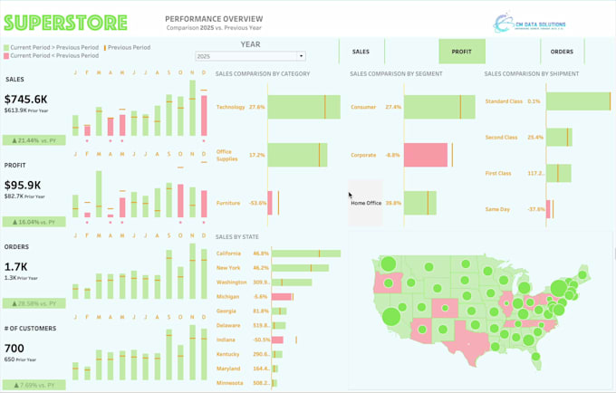
I create powerful data visualizations and interactive dashboards that turn raw data into clear, actionable insights. Using tools like Tableau, Python (Matplotlib, Seaborn, Plotly), Excel, and D3.js, I design visuals that bring your analysis to life.
From trend and correlation graphs to statistical analysis, regression models, heatmaps, scatter plots, and KPI dashboards, I deliver visuals that help you explore, explain, and present your data with confidence.
Whether you need a business dashboard, a scientific analysis, or a custom Python visualization, Ill help you communicate your story through data beautifully and effectively.
Turning your Idea and Raw Data into Real Results with AI and Analytics
Languages
What kind of data can you work with?
I can work with CSV, Excel, SQL databases, JSON, or API data sources. If your data needs cleaning or transformation first, I can handle that as part of the analysis package.
What do you need from me to get started?
Please provide your dataset (or a sample), describe your goal or question, and let me know if you have any preferred visualization style or color scheme. I’ll handle the rest.
Can you help with data analysis as well, not just visuals?
Absolutely. I can perform statistical analysis, regression modelling, trend analysis, or any exploratory data analysis (EDA) needed before creating visuals.
Will I receive editable files?
Yes, you’ll get both the visual outputs (dashboards, charts, etc.) and the source files or code notebooks if requested, so you can reuse or update them later.