Browse categories
Explore
Fiverr Pro
English
$
USD

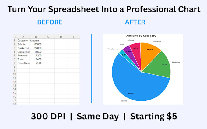
Struggling to make your data look professional?
Raw spreadsheets don't impress anyone clean charts do.
Send me your CSV or Excel file and I'll turn it into a
beautiful, professional chart ready to present or publish.
WHAT YOU GET
- Bar, line, pie and horizontal charts
- High resolution PNG (300 DPI print quality)
- Value labels on every bar
- Clean professional styling
- Fast delivery
PERFECT FOR
- Business reports and presentations
- Sales and revenue tracking
- Survey and research results
- Budget breakdowns
- School and university projects
HOW IT WORKS
1. Place your order
2. Send your CSV or Excel file
3. Tell me which columns to use
4. Receive your charts fast
FORMATS ACCEPTED
.csv .xlsx .xls Google Sheets link
Not sure which package? Message me first
I reply within 1 hour.
Languages
What file do I need to send you?
Any CSV or Excel file works. A Google Sheets link is also fine. Just share it after ordering and I'll handle the rest.
What if I don't like the chart?
I offer revisions on every package. Just tell me what to change — color, title, layout, font — and I'll fix it same day.
Can you handle large datasets?
Yes. Files up to 10,000 rows are no problem. If your file is larger just message me before ordering.
Do you offer monthly recurring work?
Yes. If you need charts every month for reports or dashboards message me and I'll set up a custom subscription package.