Browse categories
Explore
Fiverr Pro
English
$
USD




Building a scalable product requires more than reusable UI. Your team needs a consistent system that works across both code and product.
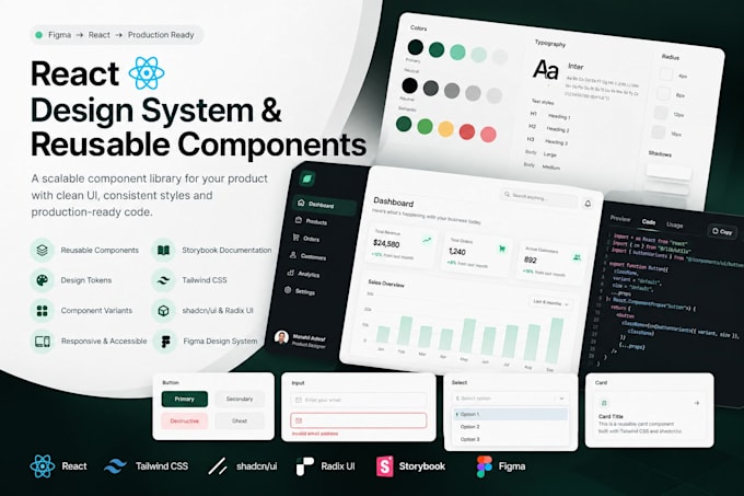
I will build a production-ready React design system and component library using React, Tailwind CSS, shadcn/ui, Radix UI, and Storybook.
Depending on your package, I can work with your existing brand guidelines or help define your products visual foundation through research and UI consultancy.
What you can get:
Reusable React components
Tailwind CSS implementation
shadcn/ui & Radix UI
Storybook setup & documentation
Colors, typography, spacing & tokens
Component variants and states
Responsive components
Light/dark theme support
Figma component library (Premium)
Brand & competitor research (Premium)
Ideal for SaaS products, startups, dashboards, web apps, and growing product teams that need consistency and scalability.
Have complex components or an existing Figma file? Message me before ordering so we can define the right scope.
Modern UI UX validated with real user data
Languages
What do you need from me to get started?
Please share your existing brand colors, typography, visual guidelines, Figma file, current product, or references. For Standard and Premium packages, I can also help define or refine the visual foundation.
Which technologies do you use?
I primarily work with React, Tailwind CSS, shadcn/ui, Radix UI, and Storybook. The exact stack can be adjusted based on your existing project requirements.
Will I receive reusable React components?
Yes. Components are built to be reusable and scalable, with appropriate variants, states, responsive behavior, and consistent styling.
What counts as one component?
A standard component can be a button, input, badge, card, checkbox, select, etc. Advanced elements such as data tables, complex forms, date pickers, or multi-step components may count as multiple components depending on functionality.
Do you provide a Figma design system?
Yes. A complete Figma component library is included in the Premium package and can also be added to other packages as an extra.
Can you work with my existing Figma file?
Yes. I can use your existing Figma components, styles, tokens, and brand guidelines and translate them into reusable React components.
I don't have brand colors or UI guidelines. Can you help?
Yes. Standard includes UI consultancy and refinement. Premium includes deeper brand and competitor research, color direction, visual foundations, and the corresponding Figma and React system.
Will you set up Storybook?
Yes. Storybook documentation is included so your team can view components, their variants, states, and usage in one place.
Can you create dark mode or multiple themes?
Yes. Theme support, including dark mode and additional themes, can be added depending on your requirements and package scope.
Can you work inside my existing React project?
Yes. Please contact me before ordering and share your current stack and requirements so I can confirm compatibility and scope.