Browse categories
Explore
Fiverr Pro
English
$
USD
Data Scientist specializing in data analysis and visualization
Tools Used:
Power Query Editor, Data Model, DAX (Data Analysis Expressions), Visualizations Pane, Fields Pane, Slicers, Filters Pane, Bookmarks, Drill-through.
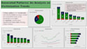
The Power BI dashboard I created provides an interactive overview of company sales, customer demographics, and product trends. It is divided into three key sections:
Sales Overview:
Utilizes line charts, bar graphs, and KPIs to track total revenue, monthly sales trends, and regional performance. Drill-down features allow analysis at year, quarter, and month levels. Regional sales maps highlight top-performing areas, with insights into seasonality and sales dips.
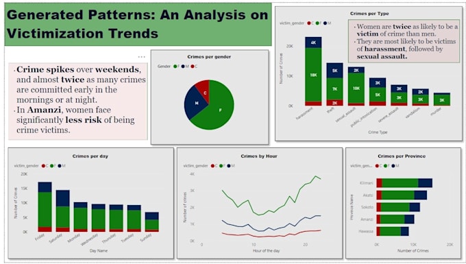
Customer Insights:
Pie charts and tables break down age, gender, and location demographics. Customer segmentation analysis reveals high-value groups and product preferences by age.
Product Analysis:
Bar charts and heat maps show best-selling products, categories, and customer correlations, identifying optimization opportunities.
Interactive slicers enable filtering by region, time, and product for dynamic exploration.