Browse categories
Explore
Fiverr Pro
English
$
USD

Are you looking for clean, clear, and professional data visualizations using Python?
I will create beautiful and meaningful charts to help you understand your data better. Whether it's for business, academics, or personal analysis I can turn your raw data into simple, insightful visuals.
What I offer:
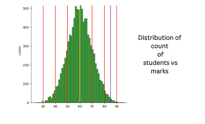
Line, bar, pie, histogram, scatter, and more
Custom colors, titles, labels, and legends
Neatly formatted visuals using Matplotlib
Delivered as PNG, JPG, or PDF
Fast delivery and clear communication
Have more than one chart?
I can create multiple charts at extra cost just send me a message before ordering.
Lets bring your data to life!
Languages
Q1: What do i need from you to get started?
I need your dataset (in Excel, CSV, or any table format), and a short explanation of what you want to visualize — like sales trends, comparison, distributions, etc
Q2: What types of charts I make?
I can create bar charts, line charts, pie charts, histograms, scatter plots, and more using Python libraries like Matplotlib.
Q3: Can u request multiple charts in one order?
Yes! The basic package includes 1 chart, but I can create more charts at an additional cost. Please contact me before placing your order.
Q4: Can u use these charts for presentations or reports?
Absolutely! The charts I create are presentation-ready, and I can provide them in high-quality PNG, JPG, or PDF format.
Q5: Do you offer interactive dashboards?
Right now, I offer static charts only. Interactive dashboards (using Streamlit/Plotly) will be added soon as I expand my services