Browse categories
Explore
Fiverr Pro
English
$
USD

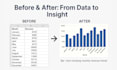


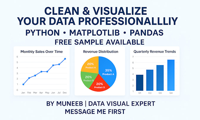
Do you have messy Excel or CSV data that needs to be transformed into clear, stunning visuals?
You're in the right place.
I'm Muneeb, a Data Science student and Python developer with a strong grip on:
I help individuals and businesses like you turn raw data into insightful charts that speak louder than numbers.
What Youll Get:
Chart Types I Specialize In:
No templates. Every chart is crafted uniquely to match your data and message.
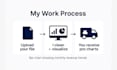
Just share your file and Ill take care of everything.
Still not sure? Message me and I'll provide a FREE sample analysis of your data so you can see the quality before placing an order!
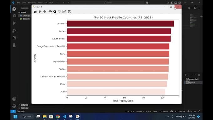
I will clean, analyze and visualize your data using Python
Languages
What type of data files do you accept?
I accept CSV, Excel (XLS/XLSX), or any structured table format. If your data is in a different format (e.g. Google Sheets or JSON), feel free to message me first.
Do you clean or process the data before visualizing?
Yes! Basic data cleaning like handling missing values or formatting is included. For advanced cleaning or preprocessing, please select the Standard or Premium package.
What libraries/tools do you use for data visualization?
I use Matplotlib and Pandas in Python to generate high-quality, custom charts and graphs. These are perfect for reports, insights, or presentations.
Can I request a specific type of chart or style?
Absolutely. Let me know if you prefer bar, line, pie, or any other style — I’ll design it exactly how you want, with your color/theme preferences too.
Can you deliver editable files or raw code?
Yes, I can provide the Python script (.py) or Jupyter Notebook (.ipynb) used to generate the charts — just let me know in advance.
Can you include the charts in a PowerPoint or PDF presentation?
Yes! This is available in the Premium package or as an extra add-on. Your charts will be presentation-ready and exportable.
Do you offer revisions if I want changes?
Yes, every package includes revisions (1 for Basic, 2 for Standard, 3 for Premium). I want to make sure you’re completely happy with the result.
What if I’m not sure what kind of chart suits my data?
No problem at all. Just send over your dataset and I’ll analyze it and suggest the best type of visual based on your goals.
Do you offer a FREE sample before I order?
Yes! I can analyze a small part of your data for free to help you decide. Just send me a message with your file.