Browse categories
Explore
Fiverr Pro
English
$
USD


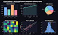
Do you have data with no clear way to understand it? I'll turn your raw data into clean, professional charts and visualizations using Python.
I use Matplotlib and Plotly to build bar charts, line graphs, pie charts, heatmaps, and interactive visualizations so you can see the story behind your numbers.
What I bring:
Strong Python skills Pandas, NumPy, Matplotlib, Plotly
Clean, presentation-ready visuals
Static charts or interactive charts your choice
Clear communication before starting
How it works:
1️ You share your dataset and what you want to show
2️ I clean the data and build the visualizations
3️ You get polished charts, ready to use
Whether it's sales numbers, survey results, or research data, I'll make it clear and visual.
Message me before ordering if you're unsure which package fits your data.
AI ML Engineer LLMs RAG Pipelines Chatbots Python
Languages
What file formats do you accept?
CSV, Excel (.xlsx), or JSON — send whatever format your data is currently in.
What's the difference between static and interactive charts?
Static charts (Matplotlib) are image files, great for reports and presentations. Interactive charts (Plotly) let viewers hover, zoom, and explore the data — great for dashboards or web use.
Can I request a specific chart type?
Yes — bar, line, pie, scatter, heatmap, histogram, and more. Just let me know what you need in the requirements.
Do you clean messy data before visualizing it?
Yes, basic data cleaning is included in all packages to make sure your charts are accurate.


