Browse categories
Explore
Fiverr Pro
English
$
USD

Level 2
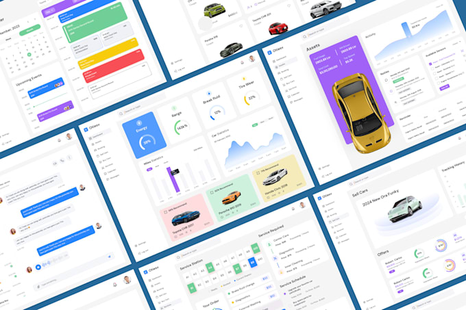
Welcome to Ripon's Premium Admin Dashboard UI UX and Web App Design Service! Transform your data into a visual masterpiece with my bespoke dashboard solutions tailored for optimal user experiences.
My Services:
Specialty:
Software I will use, and you'll get the source file (anyone):
Figma, Adobe Xd, Adobe Photoshop, and Adobe Illustrator
Information I need from you:
Note: Please contact me before placing an order. Thank you!
Regards,
Ripon
Please inform the freelancer of any preferences or concerns regarding the use of AI tools in the completion and/or delivery of your order.
Creative UI UX Designer
Level 2
Languages
What is a dashboard?
A dashboard is a visual representation of data, typically presented in a graphical or tabular format. It provides a quick and easily digestible overview of key performance indicators and metrics relevant to a specific goal or business process.
Why is dashboard design important?
Effective dashboard design is crucial for providing users with insights, enabling informed decision-making, and enhancing overall user experience. Well-designed dashboards can simplify complex data, improve data-driven decision-making, and save time for users.
What are the key elements of a dashboard?
Dashboards typically include visualizations (charts, graphs, maps), key metrics, filters, and sometimes narrative elements. The layout should be intuitive, and the design should prioritize clarity and simplicity.
How do you choose the right visualizations for a dashboard?
The choice of visualizations depends on the type of data and the message you want to convey. Bar charts, line graphs, pie charts, and heat maps are common choices. Consider the audience and the context when selecting visualizations.
What is the best way to organize and structure a dashboard?
Organize the dashboard with a clear hierarchy. Place the most important information prominently. Group related elements together and use consistent formatting. Use a grid layout for alignment and balance.
How can I make my dashboard user-friendly?
Keep it simple and avoid clutter. Use clear labels, provide tooltips for additional information, and use color wisely. Allow for customization and interactivity where appropriate, such as filters or drill-down options.
Can I get unlimited revision?
Yes.
Can I check the design before delivery?
Yes.