Browse categories
Explore
Fiverr Pro
English
$
USD


I will help you turn your raw data into clean, simple, and meaningful visualizations. Whether you need charts for a project, report, business, assignment, or presentation I can create high-quality visuals using Python, Matplotlib, and Seaborn.
What you will get:
Clean and easy-to-understand charts
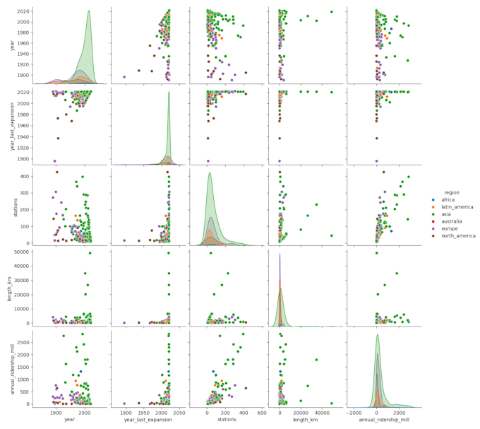
Line, bar, pie, scatter, histogram, heatmap & more
Custom colors, labels, titles, legends
High-quality PNG/JPEG/PDF output
Quick delivery and clear communication
Tools I use:
Just share your dataset (CSV/Excel) and tell me what type of chart you need. I will handle the rest!
Languages
What type of charts can you create?
Line, bar, pie, scatter, heatmap, histogram, box plot, and more.
What files do you need from me?
Please provide your data in CSV, Excel, or Google Sheets format.
Can you clean or organize my data?
Yes! Light data cleaning is included. Advanced cleaning is available in extras.
Will you explain the charts?
Yes, I can provide short insights in the Standard & Premium packages.