Browse categories
Explore
Fiverr Pro
English
$
USD

Level 1
Reserved for Those Who Demand the Best
Skills
See my services
Want to work on an hourly basis?
Tell SyncAutomate what you need.
$25
/
hour| (46) | ||
| (0) | ||
| (0) | ||
| (0) | ||
| (0) |

faithdoley

France
The wing-blade fusion is subtle but unmistakable once you see it — it doesn't read as two separate ideas glued together, which is exactly what I was nervous about. The trailing motion line gives it real speed without looking like a racing-stripe cliché. Looks sharp as a tiny avatar and even sharper blown up on a banner. Couldn't be happier.
$50
Price
5 days
Duration

rickardpetter

United States
Grim and intense, the howling wolf is beautifully menacing. Red and gray tones create real dread and atmosphere. Typography's torn edges match the primal theme. Great for team branding and merchandise.

Seller's Response

daviddohoney

Canada
This exceeded what I pictured. The ninja's negative-space detailing is genuinely clever — I didn't expect the kunai to read that clearly at icon size. The red accents are restrained enough to feel dangerous rather than cartoonish, and the motion lines give it real velocity. Tested it on a jersey mockup...
Seller's Response
james_mccleary1

United Kingdom
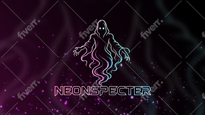
Stylish and unique, perfectly captures the vaporwave vibe. Pink and cyan combo is vibrant and eye-catching. Typography integrates perfectly with the logo. Very versatile for all gaming branding uses.
Seller's Response

fenlith
United States
This is exactly the "wind-down" mood I was going for and honestly explained badly — the fox looking back over its shoulder feels like such a warm goodbye gesture. The firefly detail near the bottom adds movement without being distracting. Font pairs beautifully with the palette. Viewers have told me it feels like a little bedtime story ending the stream.
Seller's Response