Browse categories
Explore
Fiverr Pro
English
$
USD


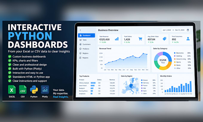
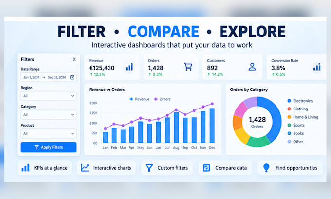
Turn Excel or CSV data into an interactive Python dashboard that makes KPIs, trends and performance easy to understand.
I build Plotly dashboards for sales, revenue, operations, finance, product and customer analysis.
May include:
KPI cards
Bar, line, area, pie and time-series charts
Filters by date, category, product, customer or status
Hover details, tables and comparisons
Package-appropriate data cleaning
A clean business layout
You receive:
A tested interactive dashboard
Agreed output files
Setup and usage instructions
Package revisions
Premium includes Python source. Standard source may be provided by prior agreement or custom offer. Basic does not include Python source.
Basic and Standard normally use standalone interactive HTML. Premium may also include a local Python app when appropriate and agreed.
Message me before ordering with a data sample, required KPIs or questions, and preferred style.
Live APIs, databases, Google Sheets sync, web embedding, cloud/server deployment, user accounts and advanced data engineering require a custom offer.
This gig covers business dashboards. Maps, GIS and heatmaps are handled through my separate mapping service.
Languages
What do you need from me to get started?
Please send a representative sample of your Excel or CSV data, the KPIs and questions you want the dashboard to answer, your preferred charts or filters, and an example of the style you expect.
What file formats do you accept?
Please send a representative sample of your Excel or CSV data, the KPIs and questions you want the dashboard to answer, your preferred charts or filters, and an example of the style you expect.
Will I receive the Python code as well?
Yes. You will receive the Python source files, required dependency information, sample output, and clear instructions for running the dashboard.
Can you connect the dashboard to live APIs or databases?
Live API connections, databases, Google Sheets synchronization, and automatic real-time updates are not included in the listed packages. Please contact me for a custom offer.
What kind of charts can you create?
I can create KPI cards, bar charts, line charts, area charts, pie charts, time-series charts, comparison charts, tables, and other visuals that are appropriate for your data.
Is data cleaning included?
Basic or light data cleaning is included depending on the selected package. Large, inconsistent, incomplete, or highly complex datasets may require a custom offer.
What is included in a revision?
A revision covers corrections within the originally agreed requirements. New KPIs, charts, pages, datasets, or major workflow changes may require an additional charge.
Does the Gig include deployment or website embedding?
No. Server deployment, cloud hosting, website embedding, user accounts, and ongoing maintenance are not included in the listed packages unless agreed separately.
How will I receive and open the dashboard?
Basic and Standard are normally delivered as standalone interactive HTML dashboards. Premium can also include the Python source and a local Python application when technically appropriate and agreed. Setup and usage instructions are included.