Browse categories
Explore
Fiverr Pro
English
$
USD
I will create professional, clear, and visually appealing data visualizations based on your requirements. I specialize in turning raw data into easy-to-understand graphs and charts, including both 2D and advanced 3D visualizations. Whether you need simple plots for assignments or complex graphs for research, reports, or presentations, I can help you present your data in a meaningful way.
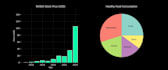
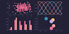
I can design a wide range of graphs such as line charts, bar charts, scatter plots, pie charts, and advanced 3D plots like surface and mesh graphs. Each visualization will be properly labeled, well-formatted, and tailored to suit your specific needs. I focus on clarity, accuracy, and presentation quality so your data communicates insights effectively.
I work with tools like Python (Matplotlib, Plotly), Excel, or MATLAB depending on your preference. You just need to provide the data and requirements, and I will handle the rest. My goal is to deliver high-quality visuals that make your data easy to interpret and professional in appearance.


What do you need from me to get started?
Kindly contact me before placing an order to discuss your project requirements. After we confirm the details, you can provide your data and supporting documents. This helps ensure accuracy and avoids misunderstandings.
What types of graphs can you create?
I can create a wide range of graphs including line charts, bar charts, scatter plots, pie charts, histograms, and advanced 3D visualizations such as surface and mesh plots.
Can you create 3D graphs?
Yes, I specialize in both 2D and 3D data visualizations, including complex and professional-level 3D graphs.
Will I receive the source code?
Yes, I can provide source code (Python, MATLAB, etc.) upon request. Please check the package details or request it as an extra.


