Browse categories
Explore
Fiverr Pro
English
$
USD
Welcome to my Data Visualization gig !
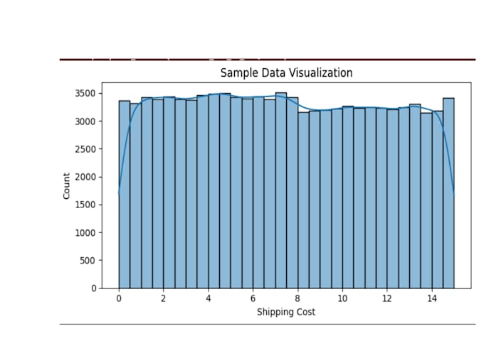
Do you want to turn your raw data into clear, insightful, and visually appealing charts and graphs? I can help! I specialize in using Python, Pandas, NumPy, Matplotlib, and Seaborn to create high-quality visualizations that make data easy to understand.
What I can create for you:
I can work with your dataset to provide interactive and insightful charts that help you make better decisions. Whether its business data, research data, or personal projects, I deliver high quality work on time.


What kind of data can you visualize?
I can work with sales, research, business, academic, or personal datasets. Any structured data in CSV, Excel, or similar formats can be visualized.
What types of charts/plots can you create?
I create Line, Bar, Pie, Scatter, Histogram, Box, Area, Count plots, and Correlation Heatmaps using Python libraries like Matplotlib and Seaborn.
Do you provide analysis along with charts?
Yes! I can provide insights and interpretations to help you understand trends and patterns in your data.
Can you handle large datasets?
Absolutely! I can work with small to large datasets, clean them, and generate meaningful visualizations.
What format will I get the charts in?
Charts can be delivered in PNG, JPG, PDF, or as Python code, whichever format you prefer.