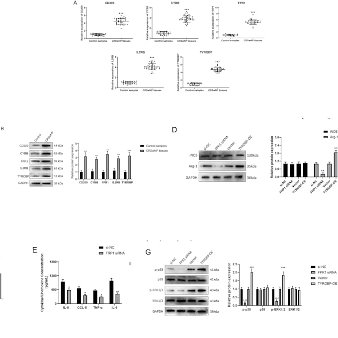
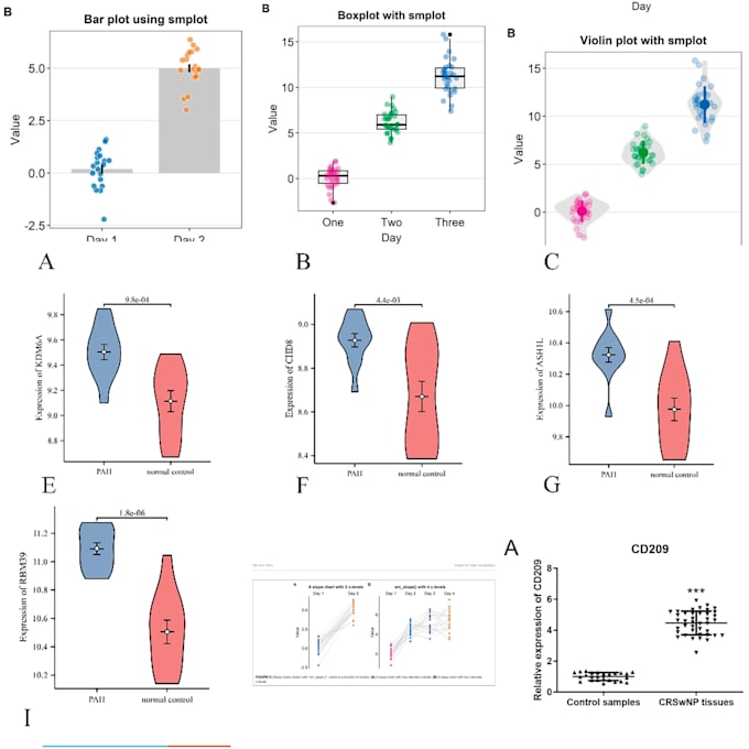
I will create scientific data visualizations in r or python

Y
yanyupan
Y
yanyupan
yanyu pan

About this gig

Basic and Standard packages are for simple bar charts, line charts, scatter plots, and box plots with error bars and legends.


Heatmaps, violin plots, dual-axis charts, 3D charts, combined charts, highly customized figures, and multi-panel layouts require the Premium package.


One independent chart or one figure panel is counted as one chart. Clients must provide clean data, labels, error values, and clear formatting requirements.


Get to know yanyu pan

yanyu pan

Scientific Data Visualization Specialist

  • FromChina
  • Member sinceJul 2026
  • Avg. response time1 hour
  • Languages

    Chinese, English, German
I provide scientific chart creation, figure polishing, and visual formatting services using Origin, GraphPad Prism, R, and Python. I help clients turn their provided data into clear, professional, and visually consistent charts for reports, presentations, and publication-ready materials. I can create and refine bar charts, line charts, scatter plots, box plots, violin plots, heatmaps, multi-axis charts, combined figures, 3D charts, and multi-panel layouts. I also help improve fonts, colors, legends, axes, spacing, resolution, and overall visual consistency.

Other Data Visualization Services I Offer

Related tags