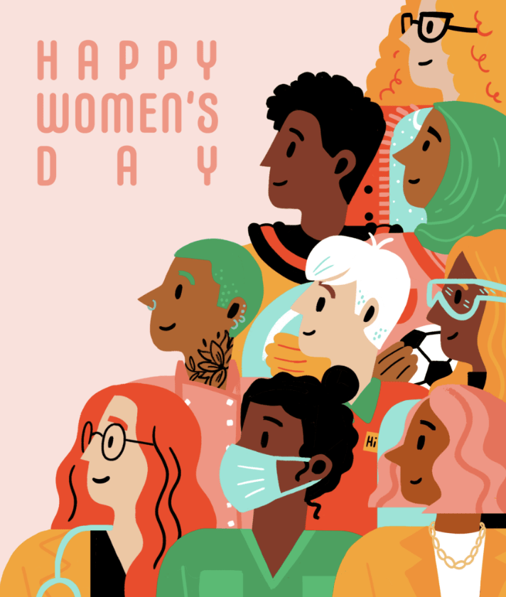
7 Principles of Design (+ How to Use Them)
Want to level up your design game? Here’s how to apply the principles of design to your next project, and how AI can help.
 June 10, 2023
 12 minute reading
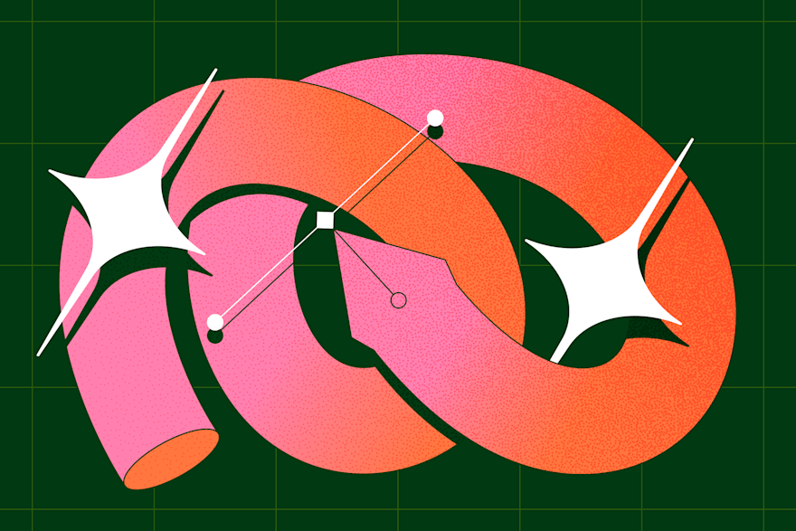
The principles of design are a set of fundamental recommendations designers adhere to create balanced, effective, and visually pleasing designs.
Graphic design serves an important role in the way consumers interact with, perceive, and experience your brand, so it’s vital that you not only understand the practice but also embrace it within your business.
Here’s the thing though: Unless you’re familiar with the principles of design and how to use them correctly, then your graphic design efforts will fall short.
We’ve created this helpful guide to teach you everything you need to know about good design principles and how to use them.
The 7 principles of design (+ examples)

1. Emphasis
- Ask yourself, "What is the most vital piece of information your audience needs to know?" This should have the most emphasis placed on it in the design.
- Create an outline of the design in your mind, allowing your brain to organize the information in the hierarchical way it sees fit.
- Lay out your graphic design to visually convey this order, based on your mental design.
- Consider utilizing elements of design, such as placing the information you wish to emphasize the most in the center, making it the largest component of the design, using a bold and eye-catching font, or using an attention-grabbing or contrasting color.
2. Balance and alignment
- Symmetrical balance, also known as formal balance, is when elements are mirrored on either side of a central line, or around a central point. It’s like a butterfly with its identical wings. This type of balance often brings about feelings of stability, formality, and orderliness.
- Asymmetrical balance, also known as informal balance, works by balancing various elements with different visual weights. With asymmetry, the sides are not identical, but the resulting composition is still balanced. Asymmetrical balance tends to create a feeling of modernity, dynamism, and interest.
- Keep in mind that each individual design element placed within your piece carries its own weight, whether it be in the form of size, color, texture, or something else.
- To keep your design balanced, you must focus on having an even alignment. In other words, don’t cram all of the design elements in one area, but rather, space them out in a way that is pleasing to the eye.
- Utilize symmetry to create a design that features equally weighted design elements that are in alignment with each other.
- Alternatively, embrace asymmetrical design by grouping elements with contrasting weights, such as one large piece of text with multiple smaller pieces of text. While it isn’t symmetrical, it still has balance.
3. Contrast
- Contrast allows a design element to “jump off the page” and is best used for parts of the design you wish to remain memorable.
- Contrast also creates a difference between elements, which can give them the space they need to “breathe.”
- The background color of your design should vary greatly from the colors of the rest of the elements, as this creates the necessary contrast to ensure the text and graphics are legible.
- Contrast is vital to text, as it allows you to signal which pieces of information are the most important to the viewer. This text might be larger, bold, or a different color, for example.
- Contrast among the text is most successful when only one or two different, yet complementary, typefaces are used within the design. You might also consider using a single typeface but in two different weights.
4. Repetition
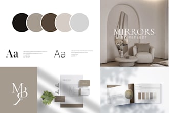
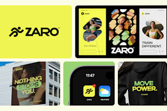
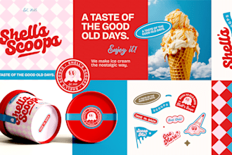
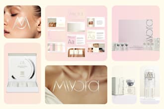
- Repetition of design elements, such as one or two typefaces or no more than three strong colors, shouldn’t be seen as boring, but rather unifying and strengthening to the overall design.
- Random design choices, such as having a single piece of text in a color not seen anywhere else in the design, can seem like an error, as if it is out of place.
- Repetition creates a motif, and therefore, puts you in control of the design and what you are conveying to your audience.
- The pattern is a great way to incorporate repetition in your design and, currently, beautifully illustrated patterns are on-trend.
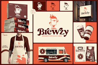
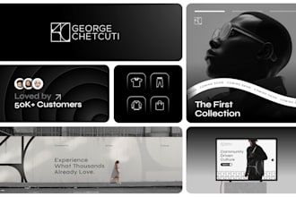
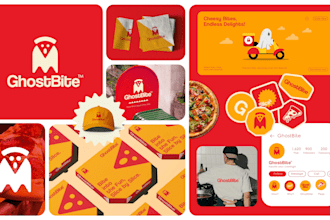
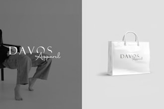
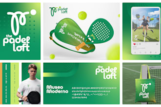
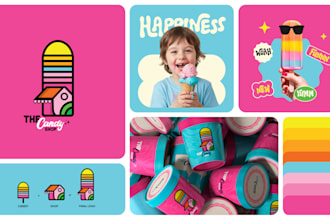
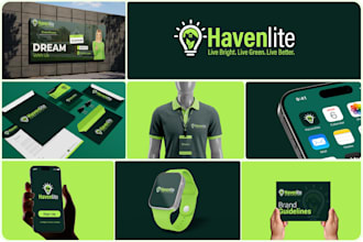
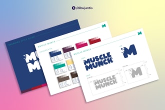
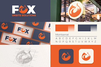
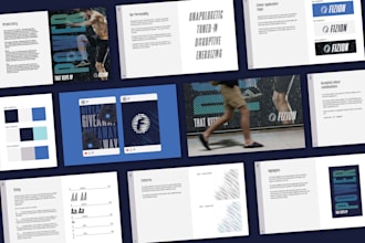
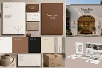
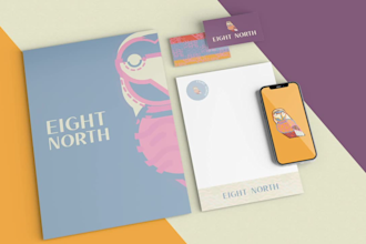
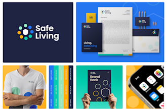
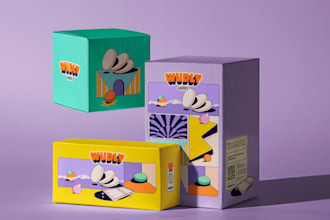
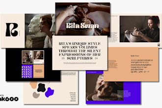
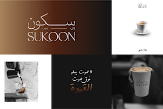
- Brand identity is another example where repetition in graphic design is necessary. This includes placing your logo on your website, business cards, social media profiles, and more. Additionally, your product packaging design should be repeated across your offering to strengthen your brand identity.
Get designs that make you stand out


Vetted Pro
I will design a business logo, brand style guide, and corporate brand identity
Offers video consultations

Vetted Pro
I will design business logo, brand style guide, branding and brand guidelines
Offers video consultations


Vetted Pro
I will design business logo and complete branding identity
Offers video consultations

Vetted Pro
I will do brand style guide, custom logo design, and branding identity
Offers video consultations
Vetted Pro
I will do logo design, branding and brand style guide
Offers video consultations

I will craft stunning visual brand identity guidelines, style guide and logo design
Offers video consultations

I will craft brand design, style guides, brand kit, brand book for luxury beauty brands
Offers video consultations


Vetted Pro
I will design logo and brand style guide, brand identity design
Offers video consultations


Vetted Pro
I will design a minimalist logo, brand book, and corporate brand identity guidelines
Offers video consultations


Vetted Pro
I will design a professional brand style guide, brand book, and visual identity system
Offers video consultations


Vetted Pro
I will do a minimalist logo, brand style guide, and brand guidelines with branding
Offers video consultations


I will build your brand identity, logo and user manual guidelines
Offers video consultations


Vetted Pro
I will design professional brand identity guidelines or style guide
Offers video consultations


I will create a unique logo and brand style guides for company
Offers video consultations
Vetted Pro
I will design brand style guide, corporate identity, and custom business logo design
Offers video consultations


I will design a professional logo and corporate brand identity with brand style guide
Offers video consultations
I will craft premium brand design, logo design, brand style guide for startups
Offers video consultations

Vetted Pro
I will design a complete brand guide and corporate brand identity
Offers video consultations


Vetted Pro
I will design a premium brand identity and logo for your business
Offers video consultations

I will create a high end brand identity, luxury branding with logo
Offers video consultations


Vetted Pro
I will create a professional brand identity for your business
Offers video consultations


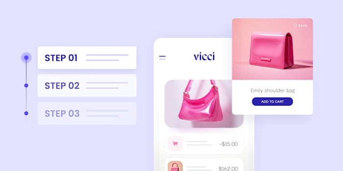
5. Proportion
- To get the proportion of your design right, it’s helpful to look at the design in sections, rather than as a whole. Then, determine if each part is balanced on a smaller scale.
- When you group smaller yet related elements together, you can give them importance based on their relationship with their surrounding elements. An example would include ticket information on a concert poster, which is often placed inside of a small box at the bottom of the design.
- Proportion can be hard to master, as all of the elements of the design must be sized perfectly and set out in a way that is visually pleasing. By mastering principles including contrast, balance, and alignment, however, proportion should naturally be achieved.
6. Movement
- There’s a Cyber Monday sale happening.
- Here’s your promo code.
- Get the sale before it’s over.
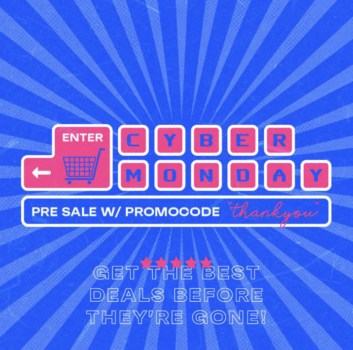
- The positioning of your design elements can create a sense of movement, deliberately guiding the viewer’s eye from one piece of information to the next in the order of importance.
- Movement is important in this manner, as it creates the narrative of your design.
- To determine if you have successfully utilized movement in your design, glance at it as a whole to determine if your eyes are drawn to a single element, particularly those that are too large, too bold, not in proper alignment, or in a color that doesn’t match the rest of the color palette.
- Adjust any element that doesn’t feel right until you finally achieve the level of harmony desired.
7. White space
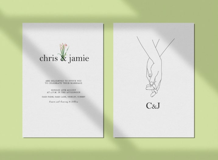
- Since white space is negative space, it encourages you to look at where you haven’t added elements to the design. In other words, it’s the empty spaces within the design, and is vital for giving your design elements room to breathe.
- Use white space to create a visual hierarchy and organize your design successfully. A significant amount of white space around an element tells the viewer it’s important.
- White space can also be used to group similar elements together, therefore communicating to the viewer that they’re related.
- Finally, white space can be used to create a different image or convey a different message entirely, when used creatively.
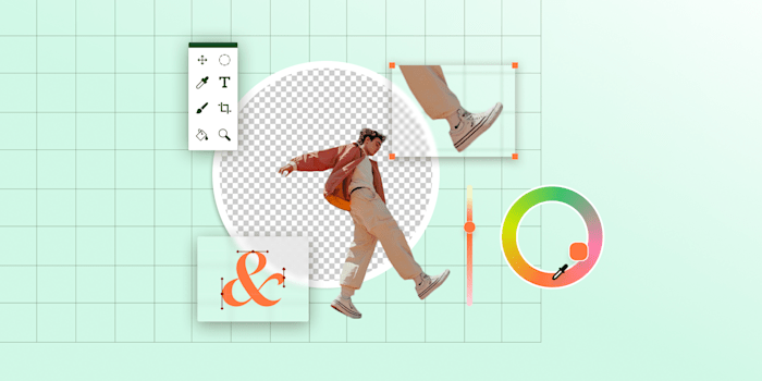
Using AI in your visual design
- Brand-related: For instance, “Create an image of a cozy coffee shop with the logo of our brand on the front window.”
- Product showcase: For example, “Design an image showcasing our latest range of eco-friendly products in a lush, green environment.”
- Event promotion: Such as, “Generate a vibrant, energetic image for our upcoming summer music festival.”
- Abstract concepts: Like, “Create an image that visualizes the concept of innovation.”
- Seasonal themes: For instance, “Design a warm, festive image for our brand’s holiday season promotions.”
- Be specific: Instead of “Create a business-themed image,” you could say, “Create an image of a modern, bustling office space with diverse employees brainstorming around a table.”
- Describe the mood or tone: For example, instead of “Design a holiday-themed image,” say, “Design a cheerful, warm, and festive image of a family opening gifts on Christmas morning.”
- Include brand elements: Such as, “Generate an image of a relaxed, comfortable living room setting bathed in the golden, cozy hues of our brand color scheme.”
The bottom line
Principles of design FAQ
What are the 7 principles of design?
What is the purpose of principles of design?
What is the principle of balance?
What are 4 examples of principles of design?
Related Guides

About author
Michael Keenan
Michael is a marketer and entrepreneur living in Guadalajara, Mexico. Through storytelling and data-driven content, his focus is on providing valuable insight and advice on issues that readers care about most.
