What is an infographic and how do you make a good one?
Everything you need to know about infographics
 October 15, 2020
 9 minute reading
Finding new ways to convey information in an engaging, attention-grabbing way to your target audience is something that plenty of small businesses struggle with. Businesses strive to get eyes on their blog posts, to stand out in the social feeds, and to properly engage their audience through a variety of different marketing content.
There is a solution, infographics.
Infographics are a creative and cost-effective way to grab your followers' and potential customers' attention while sharing information that is valuable to them. Infographics can convey information quickly and in an easily digestible format that is often readily shared on social media and by brand blogs, too.
With the right tools and strategies, high-performing infographics that help you accomplish your specific marketing goals are easy to create and offer a new format of content while helping you stay on budget.
By the end of this guide, you'll learn everything you need to know about infographics, and the key steps for creating one.
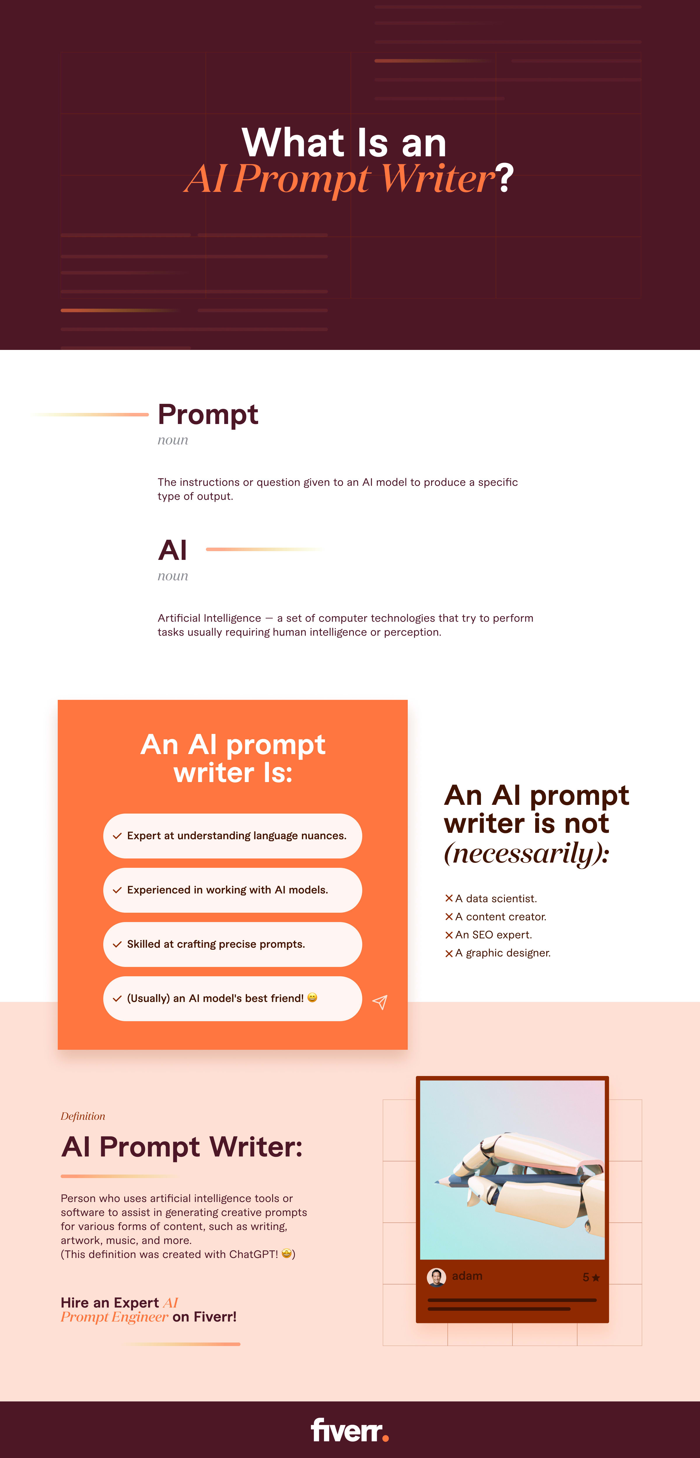
What is an infographic?
1. Infographic definition and example
2. Why use infographics?
- Provide topic overviews quickly. You can repurpose blog posts, white papers, and even webinars into infographics to create easy-to-scan content that can provide brief topic summaries or overviews that can quickly be absorbed.
- Simplify complex processes in a visual way. Visual infographics can take users through complex processes like buying a home, 3-D printing, or even hiring an employee quickly and easily.According to the Social Science Research Network, approximately 65% of people are visual learners, so visual-first media can be most impactful for these users.
- Share original data in a visually appealing way. Do you have case studies or survey results that you want to publish? Sharing it in a visual format can make a bigger impression on viewers.
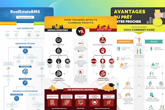
- Make a 'compare or contrast' argument more efficiently. 'Comparing and contrasting' infographics allow viewers to differentiate between two brands, products, or ideas in just a few seconds.
- Raise awareness for a cause or around an issue. Want to promote awareness around a problem in your industry, or that's impacting your customers? Infographics can help grab their attention as you convey problems and solutions in a single graphic.
- Showcase industry trends. If you're offering the latest and greatest in your industry, using powerful visual presentations to convey information about what these trends are, why they're superior to past trends, and how you're incorporating them into your product or service can be a powerful selling tool whether you're looking at recent developments in trends or the full evolution of the industry.
- Share survey results. Have you created a survey to compile original data so that you can create a case study? Infographics are an excellent option for presenting detailed, statistics-heavy data for both internal and external use.
- Demonstrate how to use your product. Some products naturally need tutorials for assembly, use, and care. Infographics showcasing product tutorials can be featured on individual product pages to improve the buyer's journey, and they can also be sent out with each item in a brochure.
- Show what the process of working with your business looks like. Let's say you start working with a graphic design agency. You want to know exactly what the process involves. If the agency can show you an infographic breaking down the steps of a first meeting, initial sketches, approval, design, and editing, you'll likely feel more confident in the agency and know what to expect.
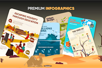
3. What are the different types of infographics?
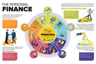
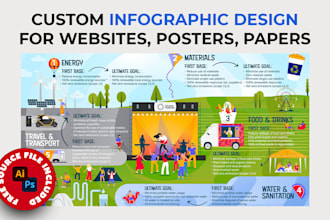
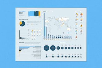
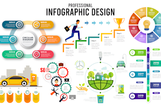
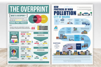
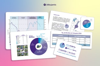
- Mixed chart infographics typically contain multiple different types of charts to convey data thoroughly. This may include a mixture of graphics like pie charts, bar graphs, scatter plots, and more. Most of the text on these infographics explains what the charts are covering. If you want to create a data-heavy visual that demonstrates benchmarks in your industry, this is a good option. An eco-friendly packaging business, for example, may create a mixed chart infographic showing hard data about how sustainable changes can improve the environment and the user's health with statistical evidence.
- List-based infographics are exactly what they sound like: a list of items, with visuals to drive the points home. This may include checklists, which businesses often use as downloadable lead magnets or for internal customers. A real estate agency, for example, might have a list PDF explaining all of the documents needed to get a mortgage approved and the steps that need to be taken.
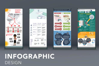
- Timeline infographics. Want to show the history of your company and its development or the evolution of your industry at large? Timeline infographics are outstanding for this purpose and can live permanently on key pages of your site. This is the most convenient way to map out different core events in a chronological way.
- Process infographics. Also sometimes referred to as 'how-to,' process infographics will detail different steps in a single process. An organic seed company might have a process infographic explaining exactly how people should plant their seeds and maintain their plants, for example. You might also see these infographics for everything from furniture assembly guides to internal resources about a hiring process.
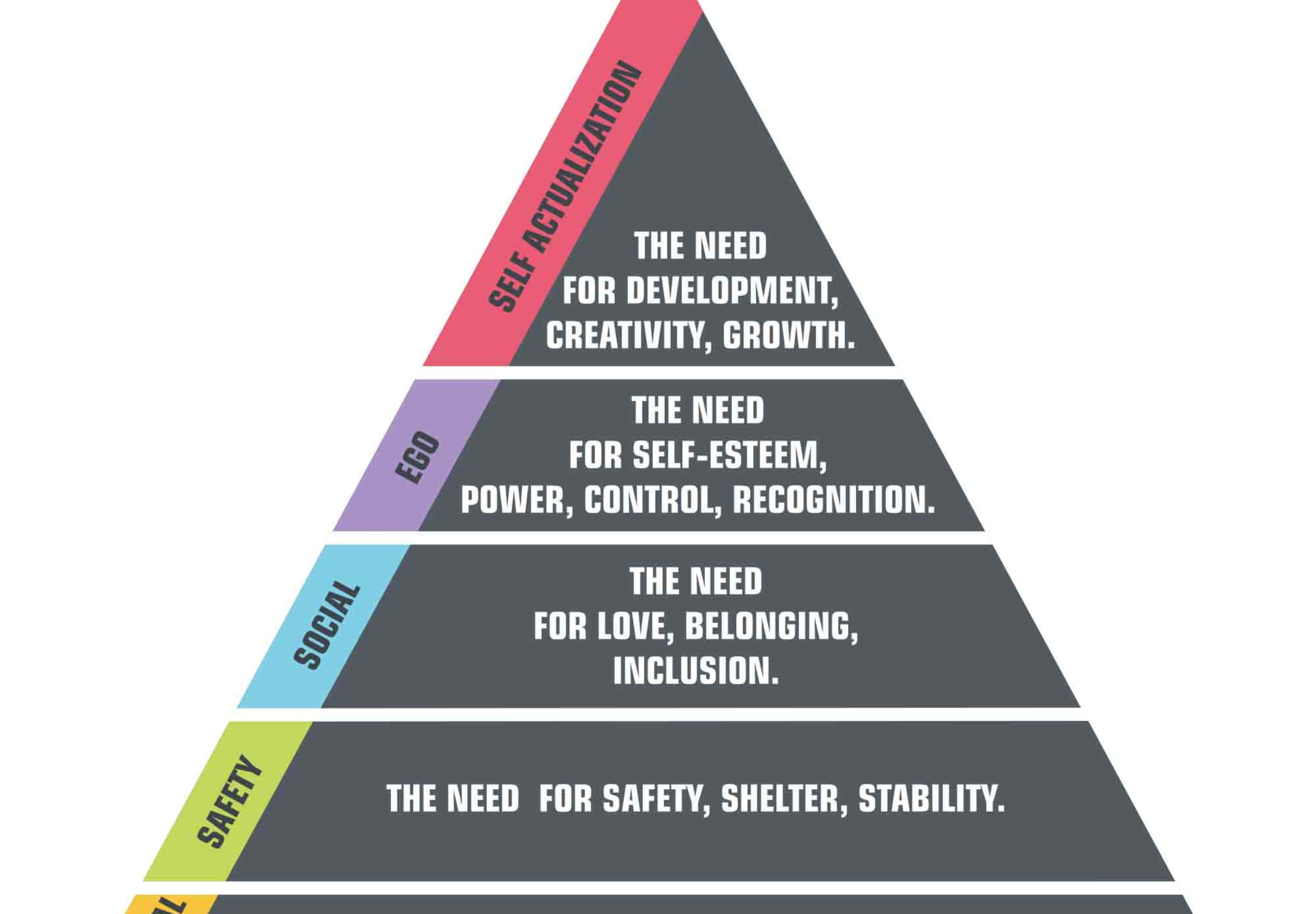
- Hierarchal infographics organize content in a pyramid-type shape. Content at the top of the pyramid may be either the most important or the rarest. A great example of this is Maslow's Hierarchy of Needs. This model puts physiological needs like shelter, water, food, and air along the bottom tier of survival needs. Love and belonging, and self-esteem needs are further up the hierarchy, and are therefore closer to the top of the pyramid, with self-actualization being at the very top. This is a visual breakdown of what could be a complex concept to help people understand basic psychology.
- Comparison infographics. Want to compare your products, services, or brand to similar options from competitors, or even older models that you've offered in the past? Comparison infographics can help with that. They're organized into two (or more, if more items are involved in the comparison) distinct columns to show the differences between each choice. These are outstanding when you're looking to set your products apart and drive sales or to build brand awareness while establishing your USP.
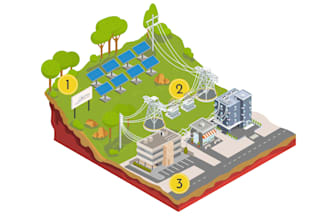
- Geographic infographics should be your go-to choice when focusing on location-specific data. A power company may show energy use in different locations on an infographic, for example.
- Flowcharts infographics can be used for several different purposes, but they're always showing a natural progression that may break off into different branches. The following are common uses for flow-chart infographics for businesses:
- Showing the breakdown of internal structures, including department heads and their level of authority.
- Taking users through specific processes, with different options branching off based on their circumstances.
- Guiding users towards specific products based on their existing needs and pain points.
- Statistical infographics are, to no one's surprise, all about statistics. These infographics feature hard data, including a list of different statistics and facts. There may also be a graph or two to display some statistics in, particularly in a visual way.
- Informational infographics are the most text-heavy of the different styles. They share information broken down into distinct sections, often with some sort of visual illustration or design alongside it to drive the point home. An office might release an internal infographic about "Healthy Work Habits" that have tips like getting up to stretch every so often, having good posture, and keeping healthy snacks in the office for short breaks.
4. Infographic design styles
Animation
Explorative
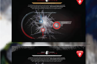
Illustrations
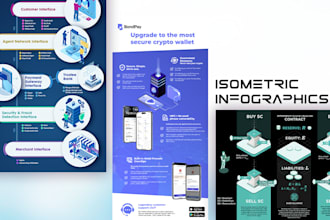
Isometric
Line
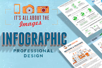
Photography
Tactile data visualizations
5. What makes a great infographic?
- Have plenty of white space. You want the infographic to be easy to view and scan, so having plenty of white space (also sometimes called "negative space") can prevent your image from looking too cluttered and overwhelming.
- Use clean lines, shapes, and borders to create distinct segments. This allows readers to process information, see ideas that are grouped together and progress through the infographic in an organized way.
- Create a cohesive color scheme that utilizes contrasting colors. You want to have one or two similar primary colors for each section of the infographic (or the infographic as a whole), and contrasting colors to help emphasize key sections or data.
- Use different sizes, formatting, and colors for text. Just as you'd break down a blog post under a single headline and multiple H2 headers, you can do the same in an infographic. Break down different sections with headlines emphasized by unique font sizes, formatting (like italics or bold), and colors.
- Include visual elements like graphics, icons, and illustrations to drive your point home. These can be simple, like having a light bulb next to the information about electricity and a sink next to the information about running water. Don't overlook these; they're a crucial part of high-performing infographics.
- Consider your brand and buyer psychology when choosing color schemes. Using branded colors for any of your graphic designs is a safe bet. Outside of your own brand colors, you can also consider different color schemes based on the "mood" you want to create or the psychological impact you want to evoke. Red, for example, is a harsh, attention-grabbing color, while green is more neutral and is often associated with renewal or growth. Think about the overall impact you want to create.
- Be mindful of length. While it's tempting to fit every piece of relevant information you can on your infographic, sometimes it's best to know when to make cuts. If it becomes too long or it contains too much information, you're ultimately hurting your own content because users will check out. It's typically best to have infographics be no more than 600x1400 pixels for best results. If they can be viewed on a single page, even better.
- Break up a single idea into multiple topics. Speaking of length, if you find your infographic getting too long or breaking off into too many different directions, it's likely best to create multiple graphics instead of trying to jam-pack it all into a single one. Not only will this make each design more coherent, but it also gives you more infographics to optimize for different audience niches or stages of the digital sales funnel as needed.
6. Tips for making a good infographic
Create the infographic with your target audience in mind
Identify the pain points that readers are looking to solve
Include brief intro & conclusion sections
Outline your infographic goals
- Share new information from an original case study or survey you conducted in an engaging, concise way
- Build thought leadership by compiling high-quality information
- Nurture leads by using an infographic like a checklist as a lead magnet
- Establish brand awareness and reach by having an infographic shared on social media
- Increase SEO by choosing a high-value keyword to base your infographic around
Choose relevant topics
Collect high-quality data
- Pew Research Data, which is non-partisan and offers detailed data on everything from consumer behavior to perceptions of political, scientific, and religious organizations
- Google's public data, which breaks down large datasets in an easy-to-consume way for both current trends and future forecasts
- Statista, which is a massive platform sharing statistics and information about businesses and market data
- World Bank Open Data, which offers open data from studies like those examining international debt, gender divides, health nutrition by population, and more
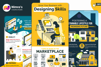
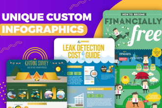
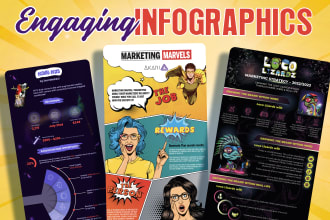
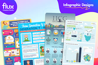
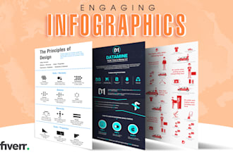
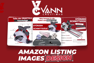
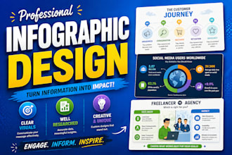
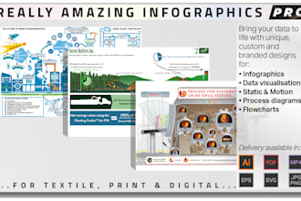
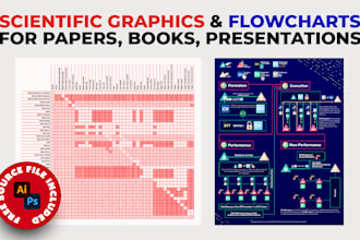
Hire an infographic designer
- Experts will have strong experience in creating gorgeous designs. While infographic creation software is useful, having an expert tweaking even small details like font size, color scheme, and the amount of whitespace can make a huge difference in the overall end result. Small details can make a large impact, especially when you're trying to establish yourself as a thought leader in your industry.
- Being concise takes practice. Though it may seem easier to stick to write 200 words instead of 1000 words, the opposite is often true; it can be difficult to fit everything you want to say in just a few words. Infographic designers often have copywriting experience so they can get your point across accurately and succinctly in a small space.
- Experts can offer truly original graphic designs and illustrations. Hiring an infographic designer with graphic design experience means that you can get original-to-you designs, graphs, and illustrations.
Find an infographic designer for hire


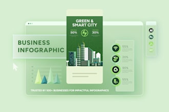
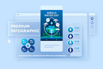
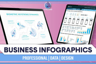
I will create an infographic that builds trust and authority
Offers video consultations
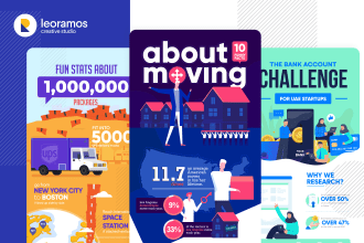

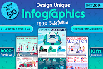


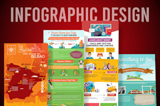


I will design engaging infographics that simplify business and marketing content
Offers video consultations


Vetted Pro
I will design data driven infographics for linkedin, reports and investor presentations
Offers video consultations


I will design any infographics for your brand with express delivery
Offers video consultations
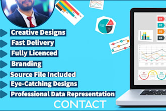


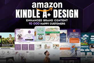


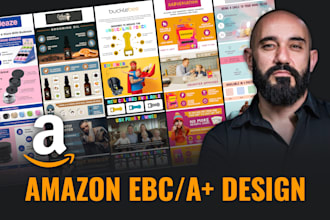
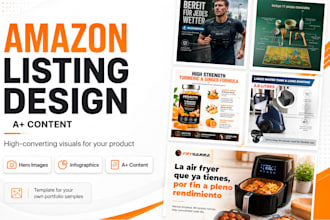
I will design amazon ebc a plus content that boosts conversions
Offers video consultations


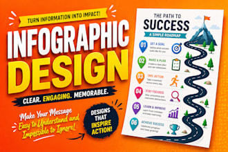
I will design premium business infographic, diagram and flowchart
Offers video consultations
I will design premium marketing infographic, roadmap or flowchart
Offers video consultations


I will creatively display information using professional skills
Offers video consultations

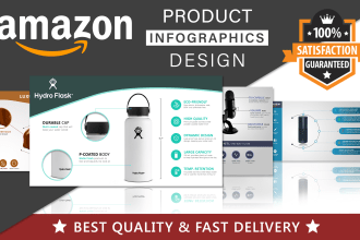
I will design an amazon product infographic that crushes your competition
Offers video consultations


I will design high converting amazon listing images that boost CTR and sales
Offers video consultations

I will design attractive and professional infographics for your presentation
Offers video consultations


Create a strong content distribution strategy to maximize reach
- Use them as a blog post substitute. Instead of writing a full-fledged blog post, some brands will upload infographics to their site blog and have it appear as the entirety of the "post." We do recommend adding an introductory text section so that you can optimize it properly for SEO, and a conclusion with a CTA to maximize results.
- Embed them into blog posts. Adding infographics to relevant blog posts (or creating an entire blog post around the visual itself) allows you to improve the quality and memorability of a blog post while increasing the potential SEO reach of the infographic itself.
- Attach them to high-value landing pages as lead magnets. Landing pages designed to capture user information typically benefit from some sort of lead magnet that actually encourages users to fill out that contact form and submit it. Imagine being interested in getting in touch with a live answering service and then seeing that they have an infographic about the best customer service tips you can get for free if you share your email address; it's a win-win.
- Offer them as a free resource for existing leads through email. When you're nurturing leads, you want to use every opportunity you can to keep them engaged. Let's say that new leads sign up for your webinar about home security that's designed to subtly promote your business's home security system. You can follow up the webinar with an email to new leads sharing an infographic that details the best tips to keep your home safe when you go on vacation. It's relevant, and it's offering new, actionable information for your audience.
- Share them on social media. Visual content is key on social media; platforms like Instagram and Pinterest require images in order to post, and Facebook and Twitter both see increases of at least 20% engagement when an image is attached. Share your infographics on social media, and always link back to your site where it's posted if possible.
- Feature them in YouTube videos. Is your team creating in-house YouTube videos or other video content? Consider including a slide showing your infographic, even creating a video around your infographic topic. The more you can repurpose the content, the better, and you can always drop a link in your video description that shows users where they can download it for themselves.
- Include them in client pitch decks. Some businesses need to submit client pitch decks or investor pitch decks as a core part of growing their business. If you have a relevant infographic, include it in the pitch deck. Use it to show potential growth in your industry, the value of your business, and how the viewer can benefit from what you have to offer.
7. How to create infographics
Step 1. Create a strong creative brief
- Project name
- Infographic topic
- Summary of the core message
- Target audience description
- Tone/brand personality
- Key points to cover
- Data you will include
- Specifications (dimensions, orientation, etc.)
- Media to be used
- Style guidelines
- References/examples
- Additional guidelines
Step 2. Brainstorm the right ideas
- SEO research: Perform keyword research to find out which topics your target audience is searching for that could translate well into an evergreen infographic.
- Tutorial: Infographics can be a great way to teach your audience how to do something. What how-to's can your business share that would help your prospects?
- Relevant data: Research industry-relevant data, reports, and studies from reliable sources. Examples include academic studies, government reports, surveys, in-house data, etc.
- Visualize existing content: Review existing content that has performed well and think about how you could possibly repurpose it into an engaging infographic.
- News headlines/trends: Is something big going on in your industry? You can spin off the news/trends and create an infographic that approaches the topic from a unique angle.
Step 3. Craft an effective infographic story
Step 4. Evaluate your deliverables
- All elements should align with the core story and your creative brief from the design and colors to the copy and organization.
- The infographic should reflect and align with your brand.Remember, every piece of content you share should be part of a larger brand strategy.
- The infographic should follow strong design principles that will attract your audience, entice them to read it, and encourage comprehension and retention.