The Role and Importance of Typography in Web Design: Expert Insights
Typography is key to web design, influencing readability, navigation, and brand identity. Choosing fonts that balance clarity, emotion, and performance creates compelling websites.
 January 21, 2025
 5 minute reading
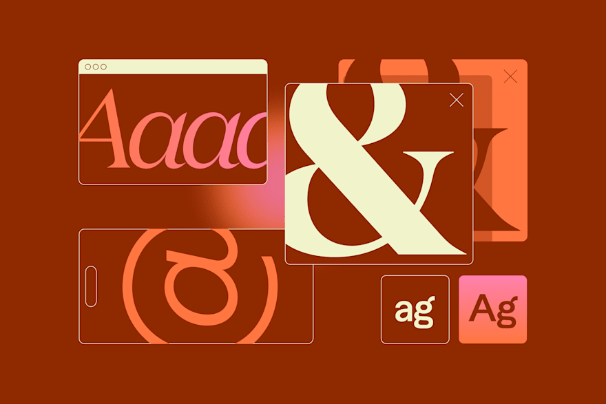
Typography is more than an aesthetic choice. It’s a fundamental element of web design that shapes user experience, brand perception, and overall site functionality.
From its origins in print to its dynamic role in digital interfaces, typography has evolved to balance beauty and usability. Modern web design uses typography to convey emotion, guide navigation, and maintain readability across devices.
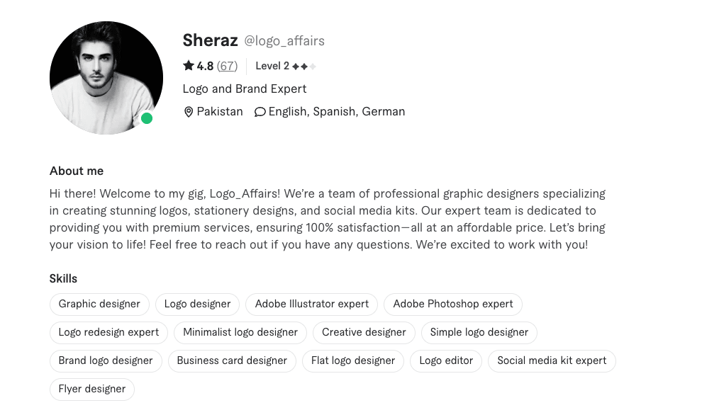
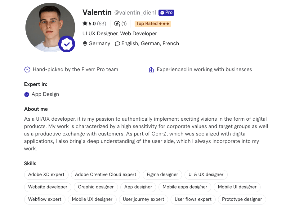
To better understand the importance of typography in web design, we’ve consulted Fiverr experts who share their insights on optimizing typography and font usage and avoiding common pitfalls.
💡TL;DR
- Prioritize readability across all devices
- Align fonts with the brand’s tone and identity
- Pair fonts thoughtfully for balance and impact
- Optimize fonts for web performance
- Choose fonts that evoke the right mood
- Balance uniqueness with usability
- Avoid overly stylized or complex fonts
- Don’t use too many fonts in one design
- Neglect font hierarchy in size and weight
- Overlook mobile responsiveness
- Use decorative fonts for large bodies of text
- Ignore audience context or demographics
1. Prioritize readability across all devices
2. Align fonts with your brand identity
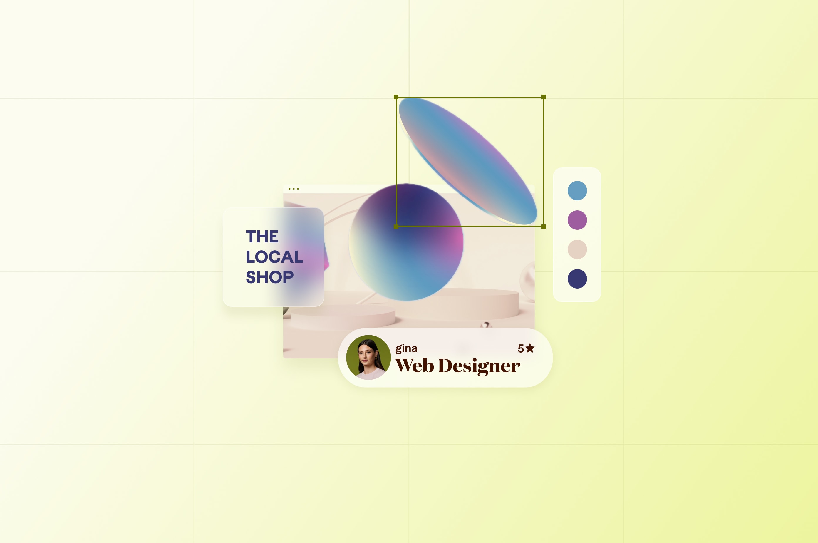
3. Create a visual hierarchy with typography
4. Limit the number of fonts
5. Test font compatibility across platforms
6. Balance typography and website performance
Elevate web design through typography
Related Guides

About the author
Fiverr Team
Fiverr is a leading digital freelance solution on a global scale, providing you with access to high-quality, specialized, and diverse human talent on an AI-enhanced platform. We pride ourselves on being the best place to get the most value for your budget—whether you’re part of a startup or Fortune 500, whether you need help on a simple task or complex project.
