Build your Ecommerce website
Find a Fiverr freelancer to help create your ecommerce site today.
1. Clean, responsive design
From Storyblok’s survey visual appeal and simple design are important factors for consumers in the online experience. They want a clean design that’s pleasing to the eyes.
Think of it as your physical storefront. You’d put a few appealing items in the front window to attract customers into your shop. The same goes for your e-commerce website.
Don’t overwhelm them with a lot of text or photos. Instead, use striking graphics and a few words or sentences to convey your most important message.
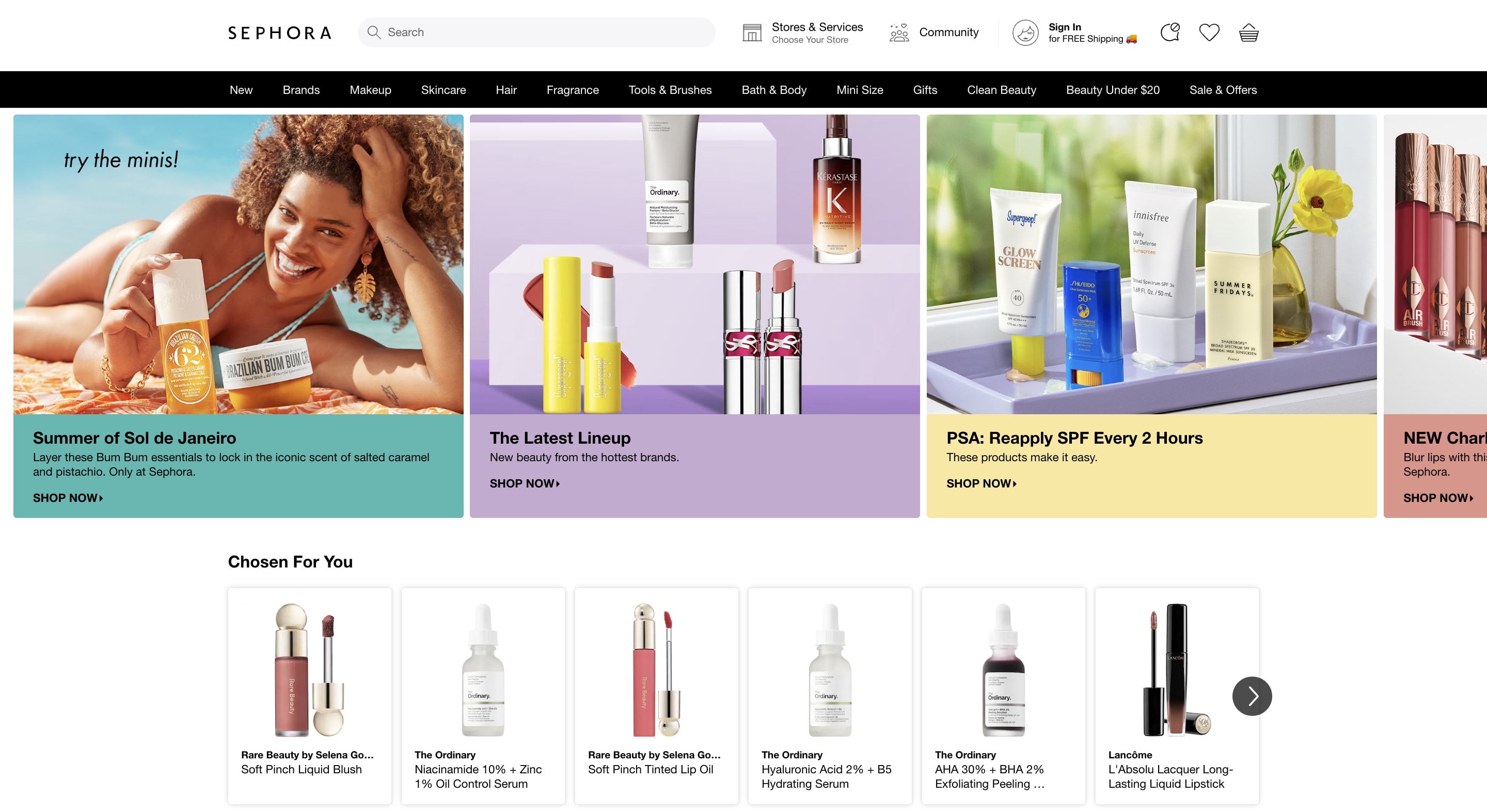
Improve your site’s UX by intelligently using white space to allow balance and breathing room for other site elements. White space minimizes distractions so users can focus their attention on your offerings and website content, making the buyer’s journey easier. See how Sephora—a multinational personal care and beauty products retailer—nails the clean, responsive design.
The company uses lots of white space, smaller images that load fast, striking product images and colors that are pleasing to the eye.
Make sure your site’s design is responsive and it loads properly and quickly across devices without visitors or customers having to pinch their screens to adjust the display. Most website themes and templates today are built with a responsive design that can adjust between different sizes and resolutions. “We increased the conversion rate of our website by reducing the friction between initial site load and purchase,” says Alex McIntosh, co-founder and CEO at Thrive Natural Care. “By ‘getting to the point’ quicker and with less "fluff" we were able to reduce the amount of empty browsing and speed up the consumer's decision to purchase.” Adopting these best practices improves your site’s design, delivers a delightful customer experience, and benefits your bottom line.
2. Consistent branding
Your customers know your brand offline. But will they recognize it online?
Your e-commerce website should mirror the look and style of your physical store. Otherwise, visitors and customers will land on your page unsure whether they’re in the right place.
It starts with an omnichannel approach to branding your site’s design. This means providing an experience on your site, social media pages, blog, and other digital channels that’s consistent with your physical location (if you have one).
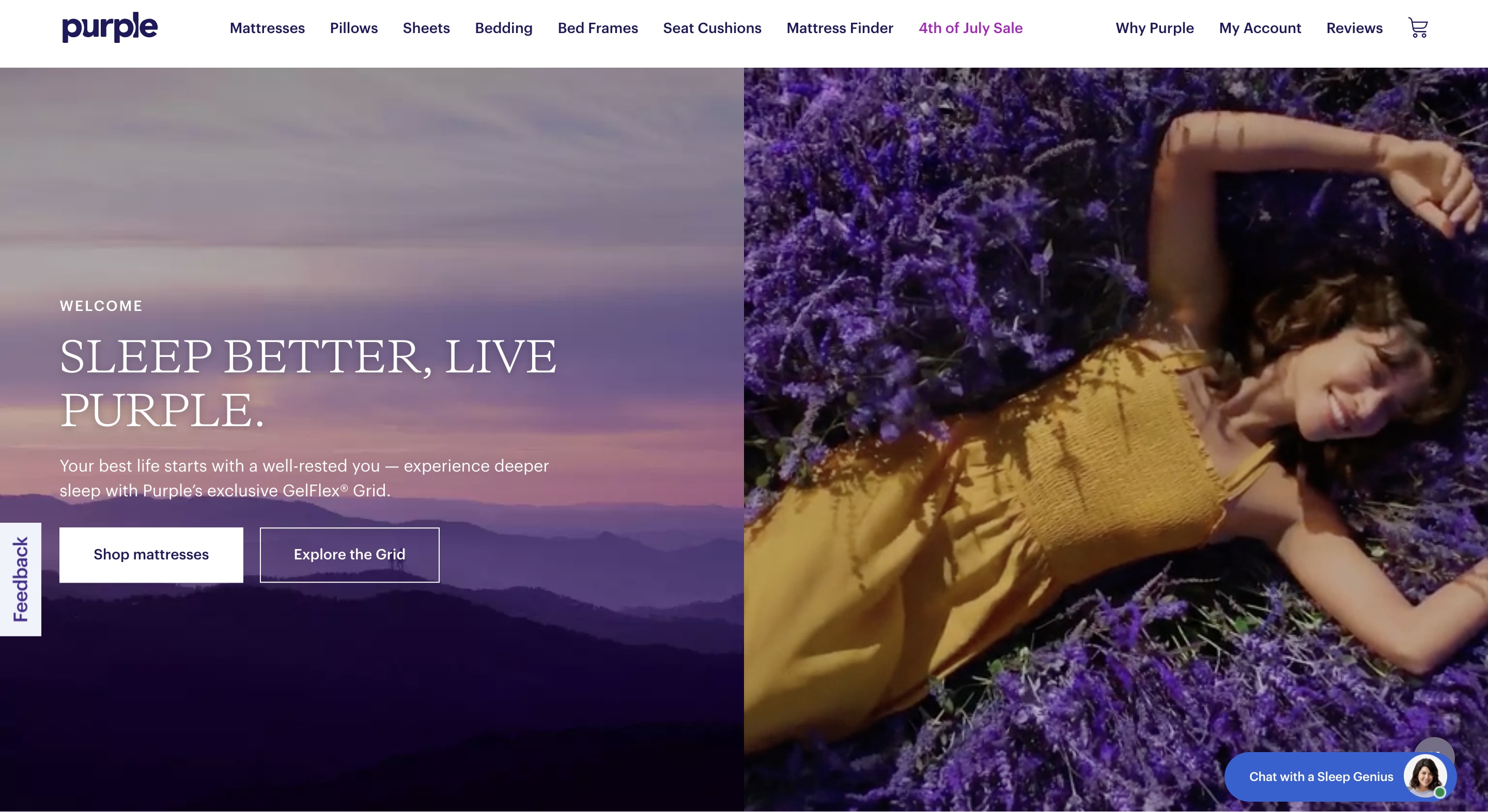
Use your brand voice and messaging in your website promotion copy and content and when interacting with online shoppers through video and chat tools. Purple Mattresses uses its brand colors and fonts across its physical and online stores. This branding consistency extends to the images and product videos the company uses on its website and its product packaging boxes. 3. Clear, intuitive navigation
Sixty-five percent of consumers consider ease of navigation the most important factor in a site’s user experience. Your site’s navigation should make it easy for people to find what they want on your site, or you could lose sales.
“My main objective was to make our website more user-friendly,” says Amore Philip, CEO at Apples & Oranges Public Relations. “I achieved the objective by surveying small businesses and asking them what is most important when navigating a website. Most wanted to know more about the company, previous work, services, and how to connect. I implemented that in our rebuild strategy.” Put things where users expect them to be so they can navigate without disruption. Your navigation bar, for instance, should be in a predictable position and easy to find. You can put it in the header or as a sidebar, using sharp color contrast to ensure it’s visible and stands out.
Also, ensure the navigation titles are easy to understand. Avoid any catchy jargon or slang as such words might confuse the user. Add a site search feature so your visitors and customers can quickly find what they need.
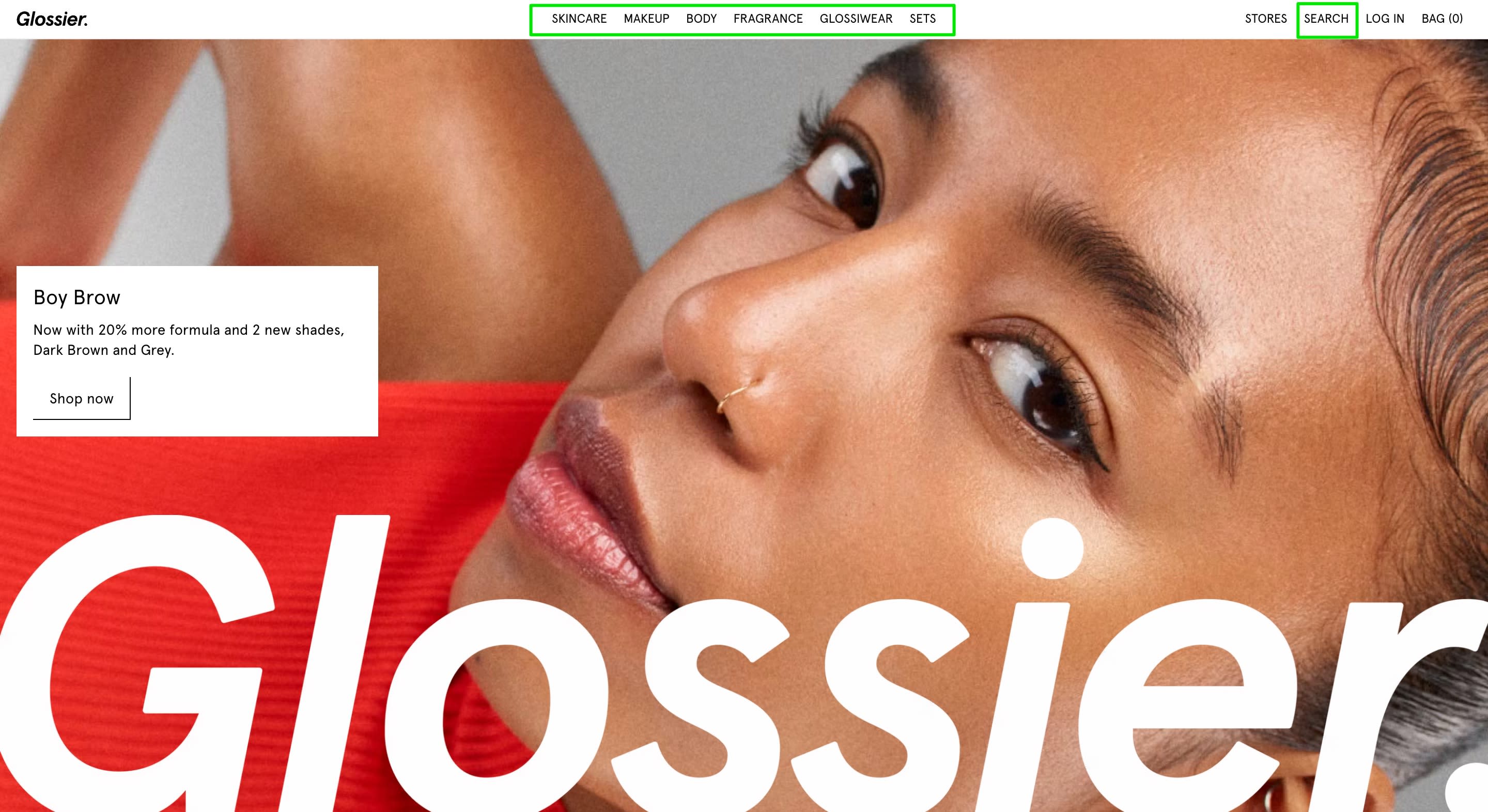
See how Glossier’s site captures these navigation best practices.
Glossier uses a clear, simple navigation bar with clear titles and a search bar on the top right side of the navigation bar. And the sticky navigation menus eliminate the need for the company’s visitors and customers to scroll back up on long pages.
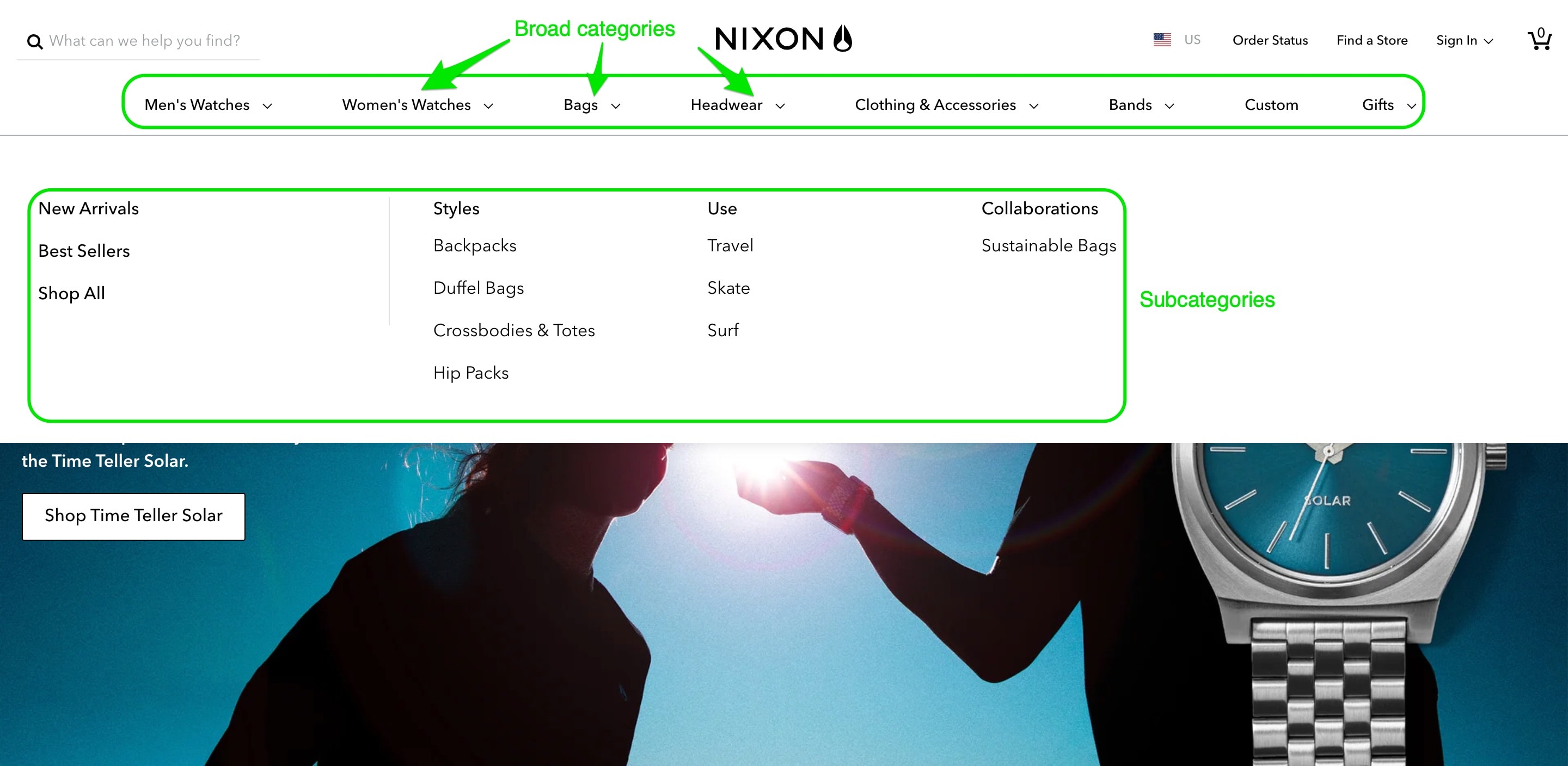
If you have many products, organize them into five to six parent-level categories and subcategories that make sense for your visitors and customers. That way they can easily find what they need and drill down for more products.
Remember, they’re not always viewing your store on a laptop or larger screen. Some may be using mobile devices, so make the experience more friendly with less navigation.
“Our research told us that we could only witness an increase in our sales if our website design was mobile friendly,” says Bender. “After all, people are always on their phones and that is how they shop, too. So we paid attention to making our website mobile friendly to cater to a larger audience.”
Nixon goes the extra mile by separating its products into broad categories and subcategories, which gives its customers multiple ways to navigate.
4. Compelling call to action
Besides knowing how to get around your site, users also need to know the next steps.
To increase conversions, your CTAs should stand out and be intuitive and frictionless. One way to do this is through colors. There’s no one-size-fits-all color for CTA buttons. For example, Samsung uses black and white on its CTA buttons.
Conduct A/B tests to identify the color combinations your customers prefer to boost your average conversion rate. Use terms or phrases that trigger actions like click here, subscribe, buy, shop now, add to cart, or checkout.
Blume does an amazing job with its CTAs, which it uses to offer up-sells on its homepage and popups while directing users along the buyer’s journey. Ultimately, this smooth process leads to a simple one-click checkout that captures conversions and boosts the brand’s sales.
5. High-quality photos and videos
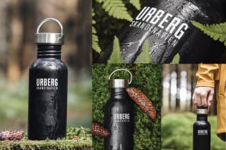
High-quality visuals are essential to any e-commerce website as they influence shoppers’ purchase decisions.
Take multiple shots of your product in different angles and lifestyle photos representing your services. For example, if you sell eco-friendly products, using photos of your team volunteering at a national park alongside your products can humanize your brand and underscore its commitment to the environment.
When customers see what your product or service would look like, it’s easier to engage and connect with them.
Leverage emerging e-commerce trends such as artificial intelligence (AI), augmented reality (AR), and virtual reality (VR) to personalize the shopping experience. AR, VR, and AI tools enable you to offer products tailored to your customers’ location, preferences, and demographic and “try” or experience your products before buying them. Visual content also benefits your site through visual search. Unlike text-based searches, which lead to hundreds of pages with similar products, visual search breaks the e-commerce noise so customers can see your offerings and make purchase decisions.
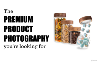
Hire a product photographer for your business today
Your primary goal is to gain revenue. To maximize on this goal, you’ll need an optimized shopping cart.
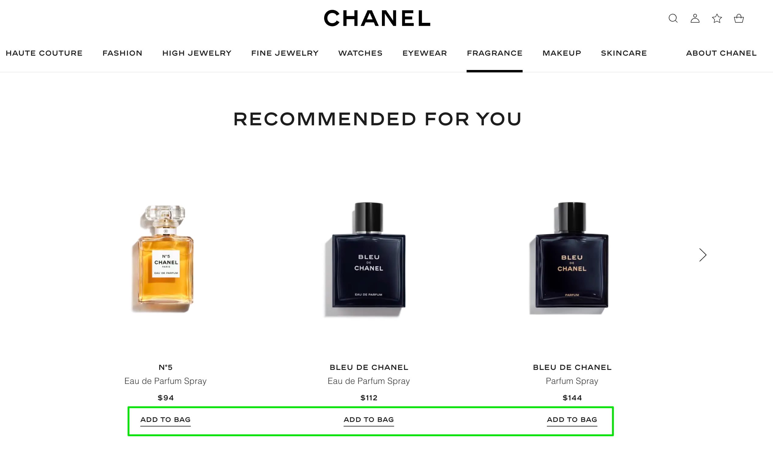
You can optimize the shopping cart experience by making your products clickable. That way, customers can review all the details—size, color, model, and more—before making a purchase.
Chanel makes its product listings clickable for customers to quickly view the details page before making a purchase. They’ve included an add-to-bag option so customers can add the product to their cart to make a purchase.
One of the common e-commerce SEO mistakes is forgetting to use SEO-related keywords, particularly those your target audience is actually searching for or is familiar with.
Conduct keyword research to find the relevant keywords and use them in your product page headers. Make your product names clickable and add every detail your audience should know in the product descriptions. That includes product price and shipping information 7. Seamless checkout
After optimizing your shopping carts, the next step is to ensure a seamless flow from product page to cart to checkout.
“The most important page on your main website is the product page and your cart to checkout flow,” says Zachary Murray, founder of Foreplay. “Those pages are directly connected to the purchase so put most of your attention, testing, and iteration there. Find robust solutions for product reviews, in-cart upsells, post-purchase upsells, and a post-purchase survey to help your marketing team with attribution.” A poorly implemented checkout process that’s too long or complicated makes customers struggle in the buyer’s journey. This impacts their purchase decisions and can lead to a drop in overall sales.
Some factors that contribute to a delightful checkout experience include:
Fast service
Guest checkout options
Easy form-filling
Progress indicators
Order previews
Persistent cart summary
Trustworthy and secure payment options
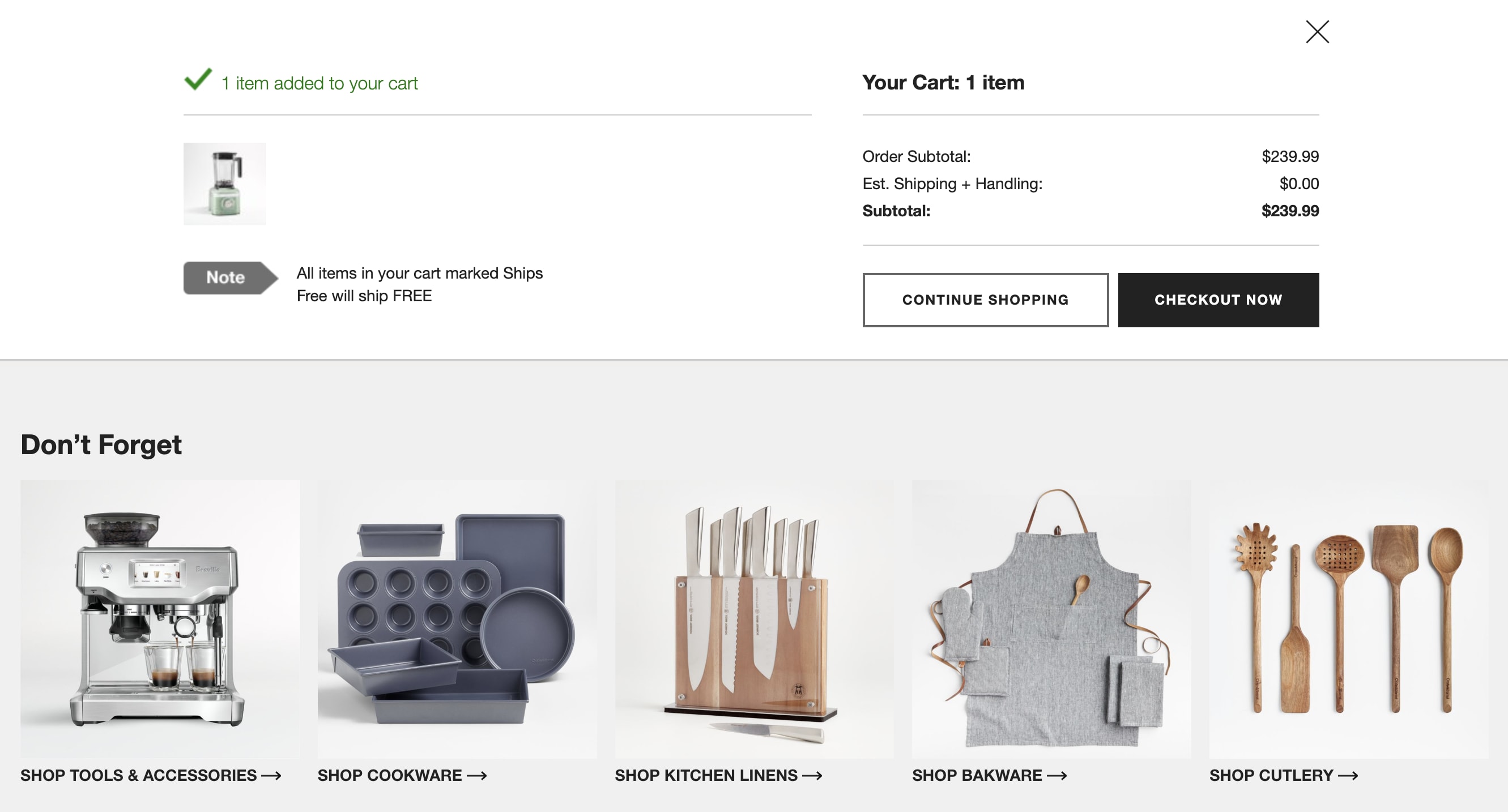
See how Crate & Barrel’s checkout process incorporates the above elements. The result is a clear order summary and a clean user interface, which encourages customers to complete their purchase.
Here are some best checkout page practices you can follow:
Add detailed shipping and return information upfront to manage customers’ expectations and encourage repeat purchase.
Display whether the products are on-hand and have remaining stock.
Display whether you offer free or paid shipping to avoid cart abandonment or customers shifting to competitor brands.
Inform customers about expected order arrival times.
Be transparent throughout the checkout process and proactively communicate with customers to create better relationships with them.
Offer real-time customer support to handle queries.
8. Security features
The risk of security breaches and hacking keeps rising with advancements in technology.
Cyber threats, which include phishing, malware, and SQL injection, can damage your site, causing loss of data and consumer trust.
That’s why your site must have strong security features to safeguard yours and your customers’ data and information online.
Some security measures you can implement include:
Installing a Secure Socket Layer (SSL) certificate and switching to HTTPS to ensure data privacy between web servers and browsers. Setting up multi-factor authentication to verify login attempts and maintain integrity of your accounts.
Regularly reviewing all website plugins and third-party integrations running in our store
Implementing strong, unique passwords to reduce the risk of getting compromised.
Using antivirus software and firewalls.
Keeping your site up-to-date by implementing software updates, bug fixes, or vulnerability patches.
Backing up your data regularly so it’s easier to get back up and running in case of a breach or you lose access to your data.
9. Multiple payment options
Provide multiple and flexible payment options and methods to enhance the customer experience.
Most sites offer the standard credit card, debit card, and digital wallet options, such as PayPal, Apple Pay, Stripe, and Google Pay. Find out the specific payment options your customers prefer and—if possible—add them to your store.
Cryptocurrencies are quickly becoming the norm. Fiserv found that 61% of Gen Z and millennial consumers want their bank or credit union to hold crypto. It’s worth considering if this is your target audience, but make sure it’s done within acceptable global terms and security regulations. Providing multiple payment options also ensures customers don’t abandon their carts when a payment channel is down. They’ll have other ways to pay, making your site more flexible and boosting sales.
Display all the payment options prominently before checkout to assure customers they can complete their purchase and even switch currencies for their payment.
Want to learn about contact pages? Keep reading.
10. Contact page with multiple options
Once someone makes a purchase on your site and trusts your brand, the next thing is to build a relationship with them.
Besides adding their contact to your mailing list, your store should have a contact page with multiple options to reach you should they have questions, concerns, clarifications, or feedback.
Contact options could be in the form of:
A Frequently Asked Questions (FAQs) page
Help center (with video tutorials or free courses)
Contact form
Live chat
Call option (chatbot and human agent) Social media page links
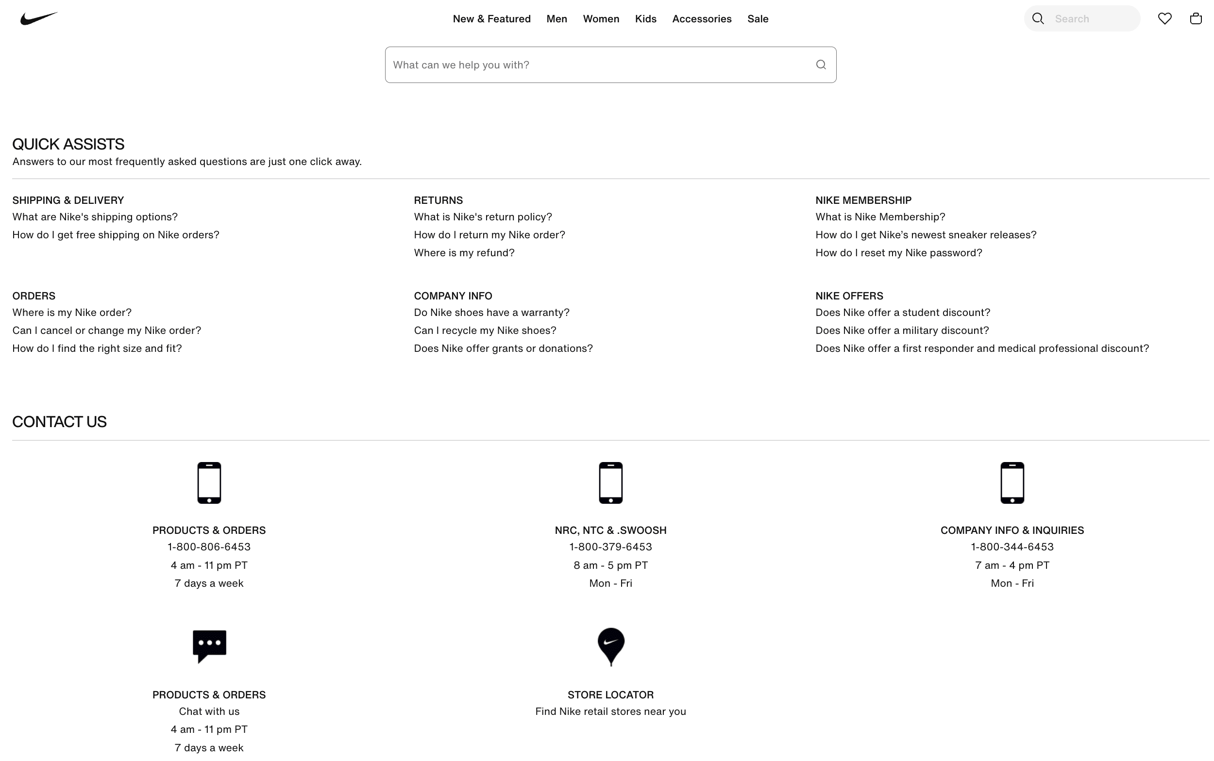
Here’s an example from Nike’s Help page:
Tips for building or improving their e-commerce website
Your e-commerce website’s design contributes significantly to the overall customer experience, revenues, and business growth.
We interviewed other e-commerce business owners with thriving online stores. Here are some tips they shared to help you build and improve your site’s design that delights customers:
Focus on the purpose of your website.
Understand your target audience, your position in the market, and the demographics.
Ensure customers can find everything as soon as they land on your site.
Create an omnichannel platform to increase your reach, connect with customers wherever they are, and provide consistent, seamless experiences.
Make your site’s navigation easier to retain audiences.
Choose a website builder that scales with growth and offers advanced e-commerce features. Follow a brand style guide, and create a website plan, wireframe, and mockup for your site. Perform a usability test with a few small businesses to get their feedback.
Create a website launch plan to introduce your new site.
Build a consistently good experience
You only get one chance to make a first impression, so don’t skimp on your site’s design.
If you’re not sure how to incorporate all the above elements into your online store, let Fiverr help.
Fiverr’s platform offers a chat system for communicating with sellers before hiring them. And you can manage freelancers, project files, and payments from your dashboard at no monthly charge.
Ready to transform your e-commerce website into something beautiful, interactive, and user-friendly?

 August 3, 2026
 15 minute reading